Showing posts with label interface. Show all posts

Tuesday, December 13, 2011

NMA object browser

Success! Everything came together at the end of semester.

I got on the web, got all the data hooked up and and built a simple browser interface that worked.

NMA object browser - displaying drawing (right) in context of all drawings the NMA holds (centre) and all object types (left) 
The idea was to show as much context as possible on the screen at the same time to aid greater understanding of objects in the NMA's varied collections, which is particularly useful where individual item records are sparsely populated, and to encourage browsing to other like or different objects.

On the left is a list of all object types, with counts, ordered by count. Clicking on an object type brings up all of the items of that type in the centre window. These are displayed as a thumbnail grid of images, or where images are not available as catalogue reference numbers (IRN) with truncated titles. Of course the preference would have been to have all images, but I felt it was important to include all items, and the truncated titles are still often informative and visually look ok.

Mousing over an item brings up the title in a popup box in the right corner. This is simply a div with a z-index to ensure it is on top of everything else. Upon mouse out, the popup div is removed using JQuery $.remove(). Easy. This was one issue to note - having to remember to do a mouse out as well as a mouse over function was a little tedious, although I can see it could be useful. It would have been nice if there was similar to in CSS, an additional mouse hover event - which I used to make links underlined when moused over. Using the CSS cursor propoerty, I was also able to make spans and divs look like <links> with the hand pointer.

The objects are sorted chronologically, using provenance date over associated date if both are available. Items without dates are retained, and placed at the end of the list. The year is displayed under the item image/title. Displaying as an inline histogram of sorts adds a rich contextual dimension - otherwise to find out dates one would have to zoom into an individual item record, and even then there would be no way of knowing how many other items were from the same year and what was the spread of years for items of that type. Thankfully the source data was in a consistent format with year first, and then day and month after if available, as a single string, which allowed for sorting a simple extracting of the first four characters using the JavaScript substr() method.

On the right a summary of an individual item record is displayed. The first item in the sorted list of object types is automatically loaded. Other items can be loaded by clicking on them in the display grid, or by clicking next/previous to cycle through the list. Mousing over the next/previous links also brings up the popup with title, as a preview. It was a critical design intention to keep the zoomed in display on the same screen as the full collection context, rather than in a pop up or new tab. The full record on the NMA catalogue is still linked to, for further information.

NMA object browser - mousing over a collection title highlights the objects within that collection
Like the sorting chronologically, an important intention of the browser was to hook up other ways of sorting and sub-sorting the NMA collections. I attempted and adequately demonstrated the potential of this, by hooking up collections data to the list of items of object type. I was able to build a list of the collections that these items were part of and at the top of the centre window list the 5 collections that contained the most items of object type with counts. Mousing over a collection title highlights the collection by fading all the items not in the collection. This is achieved by changing the opacity accessed neatly with getElementById(#id).style. The mouse over worked very nicely, except there were two interface issues: for long lists you couldn't scroll to the bottom of the list without mousing out; and I didn't have room at the top of the window to list more than 5 collections.

There would be some easy extensions to this browser, which I would pursue if it was to be hosted on the NMA labs website - that is basically more links, more context. Clicking on a collection would bring up that entire collection in the browser centre window, and browse mode could be flipped to browse by collection, with all collections listed on the left. With the same architecture it would be easy to add other browse modes, such as material type, date or associated people.

So although I didnt get time to add all of this extra context, or refine further the browser interface, or draw some graph/visualisations, I am very glad that I challenged myself and built it to be native to the web. Once set up with data, the linking and mouse events work seamlessly. I feel like I could have fun linking up more and more and more, and am now ready to tackle some more websites!

I do think I could tidy up the code and data work a little. For example I forgot about global variables for much of the project and found myself getting convoluted in passing information to functions. I also could have prebuilt more of the lists, and done all the sorting, in Processing - to speed things up at the browser/client end.

That said, the next step really would have been to develop the NMA API to handle all the data calls, and this would allow the data to always be up to date. I wouldn't want to prebuild lists every month, when the NMA catalogue is added to.

Even if in a rudimentary form, I have established my confidence in showing everything in a big data set in a meaningful way. A great project to finish the Masters of Digital Design. Big thanks to Mitchell, and also to the National Museum for the privilege of working with this special data (which now must be wiped from our systems).

Wednesday, October 5, 2011

Getting data organised

My first task with the NMA project was to get started working with the data. Mitchell Whitelaw helpfully set us up with some example code.

Our data came in a verbose xml that was too big to keep in memory in  Processing, so Mitchell showed us how to in Processing split the data and parse it into JSON format one line at a time, extracting only the data we needed. JSON is a lightweight format based on JavaScript that works well with Java (Processing).

Mitchell also demonstrated loading images from the collection (you can't load all at once - there are 20,000 in 3 different sizes!) and picking random objects to show, using a class for items. He also showed us hashmaps, which I first used with myTram - calling a key is much easier to work with than trying to remember an index position. The hashmap here contains arraylists of items organised by object type.

I used the hashmap to select a random object type to show all of the objects of that type in the collection. Clicking through random object types is not a bad way to start browsing. The data was indeed organised!

Showing an object type - motor cars, there are 11 in the NMA collection
Next I wanted to be able to sort the data, so that I could view it other than randomly. It was easy to sort an array alphabetically or numerically using the Processing sort array function, so I converted my arraylist of object types to an array, and hey presto I had a Ben Ennis Butler inspired histogram! It was indeed easy to scroll though object types and see how many of each there were.

Object type histogram, alphabetically sorted - advertising cards
Due to memory I only visualised the first 20 object types, but in the future I could have a more sophisticated way of not bothering with what was not on screen.

After this, however I was stuck. I wanted to sort numerically by the number each object type. I couldn't do this with arrays, because even if I extracted an array of all the counts and sorted this, there would be no way to syncronise it with any other lists.

The answer - to make another class for objtypes, and then to use comparators which instruct how to compare objects. In this case the comparator says when sorting an arraylist of object types to compare them based on the size of their corresponding arraylist of items.

I visualised this simply as a list for now. I would have to think about what to do visually with the scale difference between the most numerous couple of object types (6000, 3000, 2000) and the quick drop off (to a few hundred) and then a long tail (2, 1). Mitchell suggested something like a treemap that was compact.

List of most numerous object types - there are 6,000 mineral samples in the collection

List of some of the object types for which there are only 1 in the collection

I think that now I have the organisation to get started in making mockup visualisations in Processing - I still have to figure out how to translate to an online world. Hopefully I can experiment with the NMA API before building my own MySQL database.

Sunday, September 11, 2011

Data Visualisation - Canberra income by postcode

This is an October 2010 data visualisation project to develop prototype interactive charts undertaken as part of the Master of Digital Design.

Interactive Analytic Charts

This visualisation is rather a set of linked visuaulisations, developed to provide analytic context and allow (encourage) the data to be  approached from multiple points. The data set is 2003-04 average incomes by postcode compiled by the Australian Taxation Office, mashed up with a list of suburbs by postcode from wikipedia and a set of suburb boundaries which I traced myself.

Concentration of higher average incomes is clearly shown to be in older suburbs close to the centre
Subsequent rings of suburbs have progressively lower average incomes further from the centre
The main chart is a bar graph of average incomes by postcode - it is arranged by default by postcode, which relates approximately to the age of suburbs in that postcode, but can be arranged by average income rank. The population of each postcode was in the original data set and is indicated here by the width of the bars. This can be turned off, but is very useful for visually comprehending the scope of the data set. The chart also usefully has marked the Australia and Canberra wide averages.

Mousing over a suburb in the map or a postcode in the main chart brings up a detailed information box which in addition to the figures from the data set lists the suburbs in that postcode.

I have additionally added two small analytic charts - a histogram showing the spread of postcodes by average income (there are only a couple with high averages) and a summary bar graph of average incomes by region. Both of these are also interactive and can be used to assist navigation - mousing over highlights all relevant postcodes in the main chart and  in the map.

A consistent colour scheme has been used across all charts to allow intuitive reading of income concentration without needing to mouse over.

Together these charts encourage further exploration and reveal a richer narrative than any would individually - and are more informative for the mashed up additional data.

2615 in West Belconnen is the only postcode below the Australian average
Hall as a small village with it's own postcode is easily identified as an outlier
All postcodes in South Canberra region highlighted showing range of average incomes between postcodes
Income bar graph rearranged by rank without population weighting for width - no surprises the highest average incomes are in 2603 which covers Forrest and Red Hill
The visualisations show as expected that Red Hill and Forrest has the highest incomes. They also show clearly subsequent rings of decreasing average income - this is a text book diagram of most contemporary cities. I was pleased to discover outlying items such as how well off Hall was and that West Belconnen was the only postcode below the national average.

However these visualisations are also a clear demonstration that no matter how neat the visualisation is, they are always constrained by the quality of the data. In this case, postcodes are not very fine grain. It would probably be much better to do the same visualisation with suburb or even street level data. For example Griffith is in the same postcode (2603) as Forrest and Red Hill but is not nearly as rich as Yarralumla. In West Belconnen (2615) there are some suburbs such as Flynn which would be much richer than suburbs such as Page and Scullin, which are in a postcode (2614) with rich suburbs such as Aranda and Weetangera. At a more zoomed in level it should be apparent that in suburbs such as Melba and Hawker there is a substantially richer end - on top of the hill. Canberra demographics are further mixed up anyway, with planning and social policies mixing public housing and units suitable for first home buyers throughout most suburbs.

Any data that summarises, makes averages etc should be read with caution - yet it is necessary to find patterns. Therefore a strategy of showing everything available, with as many different views and levels of zooming in, out and between as possible, must be pursued to ensure that data is read in appropriate context.

This is another project I have revisited in thinking about the project for the NMA collections. It is my most refined prototype of the analytic map as interface. Here I have visualised the data in multiple analytic ways simultaneously so that a user can have many hooks for exploration and easily locate individual data within the context of the whole data set. The suburb map and the summary bar graph of average incomes by region are examples of where appropriate mashed up additions can provide richer context than was immediately in the data set.

Monday, September 5, 2011

The analytic map as interface

Proposal for this semester's Master of Digital Design project, which can be followed by the unit tag 8199.

I propose to build a simple analytic map to contextualise and make navigable in a browsable way the National Museum of Australia’s digital catalogue. Beginning with an overview and allowing zooming in to detailed tiles, maps assist the location and navigation of data by succinctly visualising complex relationships and structures. Additional context can be provided by simple analytic charts that further reveal relationships within data sets.

With the current online interface to the vast catalogue it is difficult to know where to begin browsing, it is impossible to comprehend the whole collection (scale, structure etc) and there is little context to an individual object.

My principles will be to start with viewing everything in a way that reveals structures and relationships to suggest themes to narrow viewing focus and filter the data set, and once viewing subsets or individual objects, provide context to locate them within the data set and suggest other related items to browse.

I don’t propose to build an interface such as this because I think it is particularly original – but because I am genuinely interested in personally exploring the NMA collection myself, and because I am curious to study how visualisation techniques scale.

A vast collection

The NMA collection is vast – both in total items (more than 200,000 objects) and in variety of content. On their website the NMA describes the themes of their collection as Aboriginal and Torres Strait Islander cultures and histories, Australian history and society since 1788 and people's interaction with the Australian environment, which are sufficiently broad to cover just about anything.

NMA's current online catalogue home page
NMA's object record view - often there is little information about the object or the collection it is a part of 
I previously observed that the online catalogue is not curated, and that most objects and collections are not given a contextual description that explains their significance. However the NMA does have a separate section of the website where recent acquisitions and the highlights of the collection listed under the three broad themes above are given significant contextual narrative documentation. Identifying and visualising this subset would be great as mashed up addition to an interface because it is in the Museum’s opinion the most interesting content, and more critically it is the most completely catalogued. It therefore might also be a useful home/landing page, particularly if the fully zoomed out view of the entire set is not legible.

Mitchell Whitelaw has been developing visualisations of similarly large and diverse data sets – the National Archives and Flickr Commons. Here ranking assists us to find top and bottom items, but unless already zoomed into a small subset, it can be difficult to locate middle items. Word clouds that visualise the most frequently used words in object titles, are useful in narrowing focus on content themes – Mitchell says that coverage can be between 75% and 95%, but there are outliers that are invisible. How do you locate these hidden objects?

Questions of organisation

I intend to organise browsing and zooming in around questions that I am personally interested in such as:
  • Which are the biggest/smallest objects? 
  • Which are the oldest objects? 
  • Which objects are there the most of? 
  • Which are the largest collections? 
Some questions that I would like to ask, but I doubt the public data set will have answers for, include:
  • Which objects are on exhibition? 
  • Which objects have never been on exhibition? 
  • Which objects are the most fragile? 
  • Which objects are currently the subjects of restoration work? 
  • Which records are newly added to the catalogue or have been recently updated? 
Finer grain filtering can be facilitated at the intersection of these questions – for example ‘show me old small objects’. I hope that using multiple filters in conjunction will help to find hidden objects.

Two data types that I suspect can provide interesting browsing links between collections are object material/s and associated location/s – both are linked from the current online catalogue records, but would be much more useful if they were visual and had an indication of quantity - for example ‘other objects associated with this location: 5’.

Ultimately I would love to end up with a unique visualisation. However I dont have anything particular in mind at the moment and am not going to try to think of something arbitrarily. I would like to let visualisations emerge from exploring the data. My plan is to start very simply, with what I have outlined above, and then let the data prompt subsequent questions.

A native of the web

After encouragement from Mitchell, I have decided that rather than work for most of the semester in Processing, where I am confident I could achieve a well resolved visual interface, it would be better to migrate early to native web formats that I have not worked previously with and risk less resolution but benefit from the significant challenge of learning and plugging together back end technical systems.

So I will need to translate from Processing to HTML5, CSS and JavaScript. Then I will need to ensure the large data set does not crash the browser, which can only work with limited memory. I suspect that I will have to set it up to load dynamically, which will require a MySQL database queried with PHP or Django. I am leaning toward using Django because it is built on Python, which I think I am likely to learn anyway in the future for Rhino 5 or other applications.

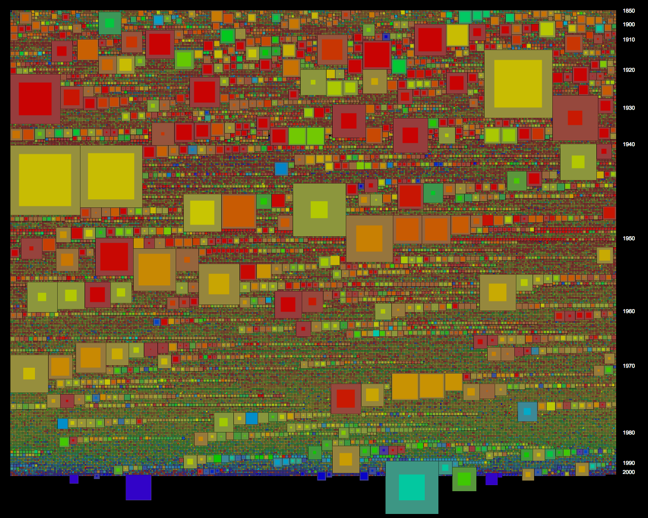
Ben Ennis Butler has suggested some clever potential work arounds for interactive web implementations of static visualisations (ie visualisations that dont require access to a database and are not redrawn dynamically), which I can fall back to if I get stuck. He did this for the histogram he designed to show the Australian prints collection at the National Gallery of Australia.

Ben Ennis Butler, histogram of Australian prints collection at NGA

This visualisation is exceptionally browsable and well suited to the scale of the collection. I am tempted to do a similar visualisation first as a test of how well it can work for a dataset the scale of the NMA collection.

Show everything

The 'show everything' approach has been advocated by Stamen, as well as Mitchell. The approach is to start with a view of everything and then zoom in and filter to subsets and individual items, facilitating a better comprehension of the scale of the entire data set and the position of an individual item within it and encouraging browsing by showing related items.

Stamen's SFMOMA Artscape does this very well, but only for a collection of 3,500 items.

SFMOMA Artscape by Stamen - zoomed out
SFMOMA Artscape by Stamen - zoomed in
Constructing the visualisation like a map with pre-generated tiles, the interface is slick. However this set up appears to limit dynamic rearrangement of tiles, leaving the user stuck with the preset ordering by acquisition date and not able to filter to a subset - searching or following keywords, artists etc allows you to zoom to items one at a time, but not able to see all subset items next to each other or skip ahead to particular items.

An interface for users

Finally, at the end of this project, if I have a working interface, I would like to do some user testing. Documenting how users explore the data would be a significant outcome that would assist developing design approaches to future visualisations, both in general terms and specific to the NMA collections.

Wednesday, August 31, 2011

myTram: a personalised Melbourne network map

This is an October 2010 data visualisation project to develop a data form (object from data) that meaningfully interprets and embellishes the source data (the Melbourne tram network). The project was undertaken in collaboration with Kerrin Jefferies as part of the Master of Digital Design.

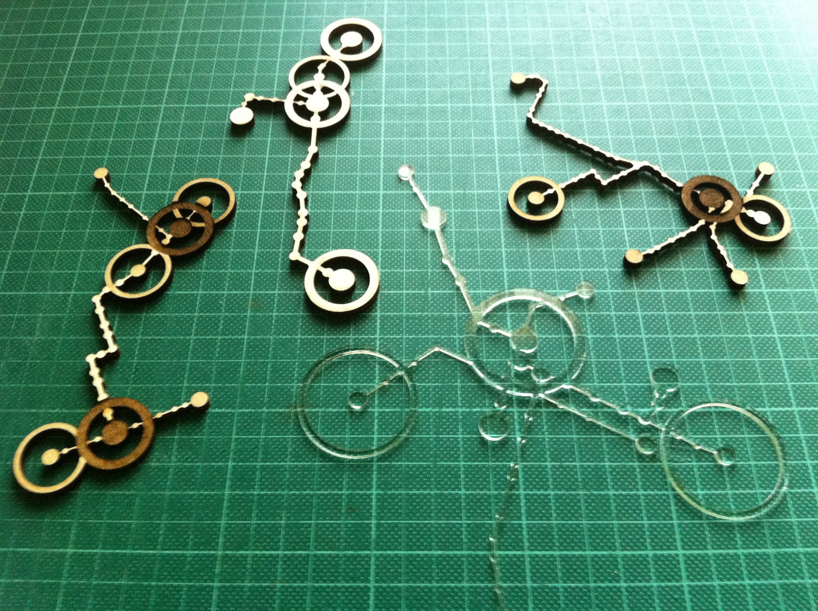
myTram data forms - laser cut/etched ply and perspex from Ponoko

Trams are critical in the definition of Melbourne urban form and culture as a primary and iconic mode of transport for inner city residents and visitors. Trams unlike trains follow the main streets, the tram network mirrors the principal geometries of the inner city grid and rotated CBD grid and as such is recognisable even to residents who do not use trams. Each route has distinct corners, bends, branches or kinks and so even a small portion of the network is identifiable.

Mapping personal use of the tram network - frequency and destination of trips, as well as the time spent at and walking range around destinations, gives a dataform that reveals substantially how the city is inhabited. As wearable jewellery or other intimate use object such as placemat or coaster, myTram is intensely personal and richly meaningful, able to prompt memory, discussion and movement from an intuitive and implicit understanding of the city to one that is more explicit.

GPS locations for each tram stop allowed accurately scaled drawing of stop locations which were matched with lists of stops on each route to approximately locate routes by drawing straight lines between stops. The route lists had misplaced stops which were removed by filtering for outlying distances between stops. As stops were located on both sides of the road and routes had travel in two directions there were selection interface issues that were exacerbated once myTrips and myStops were added. These issues were overcome with switches that could be toggled to narrow selection possibilities.

myTram interface - routes through Domain Interchange highlighted
myTram interface - myTrip Route 8 along Chapel St highlighted
myTram interface - editing time spent at and walk radius around myStops

While graphic representation on screen allowed relatively detailed information to be encoded with layered transparencies and fine lines, augmented with popups and rollovers, and navigated with filtering buttons, the laser cut data forms had to be significantly simplified to be legible. A thicker line weight was required for structural integrity and only two depths of etching were employed to ensure high contrast.

The final form was refined to just myTrips with no contextual information (grid and other routes were removed) and only two modes of trip frequency (frequent, thick line; and infrequent; thin line), time spent at myStops (primary, large radius and deep etch; and secondary, medium radius and shallow etch), and walk range around destination (greater than 500m, ring with 500m radius to scale; and less than 500m, no ring).

myTram is legible as an embellished section of a network diagram.

I reviewed this project again, now in the context of thinking about the project for the NMA collections, to remind myself of the importance of context when working with data. In this project the context is urban and personal, both rich and specific. The NMA data set is much larger and much of the context of individual objects I expect to be more ambiguous or abstract -  time, location, like items. I will have to be careful in drawing together any narrative that it is appropriate. 

Exploring the NMA catalogue - first thoughts

As part of the Master of Digital Design, this semester we will be developing data visualisation projects from the National Museum of Australia's digital catalogue. Project development can be followed with the tag 8199 (the unit number). The project is being led by Mitchell Whitelaw.

This is an exciting (and daunting) culmination of work to date. The NMA is in the process of digitally cataloguing it's very large and important collection (of collections). The NMA conserves the 'National Historical Collection' which contains more than 200,000 objects representing Australia's history and cultural heritage, of which so far 48,000 objects from 1003 collections have been catalogued. A tiny fraction of these objects make up the public exhibitions at the Museum - some of the exhibition material is valuable such as many of the indigenous artefacts, while some of it is perhaps not especially so but is important because it illustrates cultural stories (in one of the displays there is a windmill with a cut out magpie).

Phar Lap's Heart, National Museum
My first approaches to all of these objects online has me overwhelmed. Here there is no curation. I am confronted with a search box. Without having in mind something specific like Phar Lap's Heart I look to browse elsewhere. At the side there is a random selection of object thumbnails (many of the objects dont have photos, and most of them appear to be low resolution). Initially I didnt realise that these were links, but they were all the same engaging. Next there was the opportunity to browse by object type - this I found to be the most interesting - cabinets, cake tins, canoes, chemical jars, cricket balls, cut throat razors... Then there was the opportunity to browse by collection - here I was confronted by many unfamiliar names that I assumed to be donors or the focus of the collection. Unfortunately I couldn't access a description of the collection, only a list of the objects it included. Elsewhere on the NMA website I found descriptions of some of the most significant collections.

Examination of individual object records left me feeling no better connected to the material of the collections. Each item that I viewed (except Phar Lap's Heart) had a very brief factual description of the object, but little contextual information other than a date and place. I could not tell what the significant of the object was (surely some of the objects are more significant than others?) and I was not told why it was part of the National Historical Collection.

So the task I am most interested in is constructing a better narrative around these objects. Data items that stand out as possibilities to construct some analytic context are date, place, materials, dimensions, collection size and number of object type. It is my expectation that visualisations based on these data items can better situate oneself within the collection and assist navigation / browsing. It is my intention to make both visualisations of and an interface to the collection.

The designed ability to zoom in and out within a dataset and to comprehend the scale of the whole and it's parts allows large and complex data that was previously only superficially understood to become powerful and sophisticated information tools. Of course data analysis is only as valid as the source data and data can be misunderstood when it is out of context - or in a wrong or partial context.

Mitchell Whitelaw's visualisation project for the National Archives is a great demonstration of the potential for design to transform the accessibility and legibility of a large data set that was previously incomprehensible. The overview Series Browser is able to represent the entire data set of series in a way that reveals structure and relationships, while the zoomed in A1 Explorer uses a word frequency cloud and histogram to indicate some of the contents in a more succinct and engaging way than a contents or index page possibly could (the A1 series contains 65,000 items). Both visualisations suggest themes to focus or zoom further in on - and being interactive are part analytic, map and interface.

National Archives Series Browser, Mitchell Whitelaw, 2010 - series are arranged
chronologically with their size and provenance indicated

Friday, July 15, 2011

D, I & E Tile Processing Mockup V3

Is this the winning formula? Finally I have a balanced version that has multiple pressure input legible and allows emergent pattern. I have added a lock out that stops endless cycling after a reasonable time to see emergence (15 sec) if a low gate condition has been reached (lights on 3 times in that 15 sec). During a lock out period (10 sec) I imagine pressure input would result in a low buzz to indicate it was disabled.

I have kept the min off time to a minimum to maximise feedback from pressure input, and increased the flag delay and limited the max on time to ensure not all lights are on at the same time. Also I think mode 2, clockwise internal communication arrangement, is most coherent to use, because the communication between tiles is clockwise. Controls are still enabled - so keep playing!


Monday, May 30, 2011

D, I & E Tile Processing Mockup V2

Here is a revised version with controls to change variables so that everyone can have a bit of a play.

I have added the potential to set a minimum time that cells must be off before they can be turned on by neighbouring cells being on. This can be used to break the endless cycle and makes responses and interactions from simultaneous pressure sensor inputs at opposite sides of the board more legible. Unfortunately pressure sensor inputs can not be communicated to neighbouring cells that are serving a minimum time off (this is possible to code, but our physical communication setup can not differentiate the cause of neighbouring cells' lights being on). There is also then the potential to set a maximum time that cells can be off before they randomly turn themselves on.

I am not sure what the optimum arrangement is for our installation, and if it would be interesting or too unintelligible for each tile to have individual settings. So keep playing!


Sunday, May 29, 2011

D, I & E Tile Processing Mockup

Here is a quick Processing mockup of our current tile arrangement to demonstrate that lights are communicated in circles. I have also tested some alternative arrangements that produce various other emergent patterns, such as diagonal stripes, by communicating between cells within tiles. All of the arrangements produce endless loops from a single pressure sensor input, but unfortunately in all of the arrangements multiple pressure sensor inputs produce either no legible response or fairly uninteresting interactions.


Controls:
mouse click = pressure sensor input / footstep (to begin)
key q = turn all lights off
key 1 = only neighbouring tiles (current arrangement)
key 2 = neighbouring tiles plus internal cells clockwise
key 3 = neighbouring tiles plus internal cells anti-clockwise
key 4 = neighbouring tiles plus internal cells diagonal
key 5 = neighbouring tiles plus all internal cells
key 6 = neighbouring tiles plus internal cells horizontal
key 7 = neighbouring tiles plus internal cells vertical

Saturday, April 30, 2011

D, I & E Intensive 2 Day 3

We now have the projects substantially finished, but we didnt get to install them today or test how they interact or give them individualised behaviours. We will get together for another workshop in the holidays and do a test install then before the exhibition at the Belconnen Arts Centre. I suppose that is an important lesson in just how long all the little things take to get done, and how often things dont work smoothly as expected and so need resourceful on the spot thinking.

I do feel like I have come a long way in 6 days, and have confidence now to finish my tile myself - and then go on to do any other project on my own. I had never worked with electronics before this.

SOFTWARE

I wrote my first library! What a challenge - after spending the evening before adapting our code to classes as I would set them up in Processing, I spent almost the entire morning figuring out how to make them work in Arduino as a library.
Code with library header and class files in foreground
Essentially Arduino is built on C++, which has similar syntax to Processing which is built on Java - but they are not the same or directly compatible. I will have to read up more about this. The previously linked to tutorial was very helpful and got the basic setup for me.

However after hours of debugging and browsing the Arduino forums I still had one unsolvable problem - I couldn't get the constructor to recognise instances of custom classes. I had made seperate led and light sensor eye classes, and was trying to get the led class to know about their own eye as well as the other 3 eyes in the tile. So I got around this by unifying the classes in a single cell class. Lesson - try to make two classes talk to each other at your own peril!

There are a few other key differences between this and a Processing implementation:
  1. the code is written in separate files that are saved in the libraries directory of the Arduino install directory (Arduino/libraries) and edited in a text editor such as notepad, these are:
    1. Cell.cpp, the class file where all the code goes
    2. Cell.h, a header file which is like a contents
    3. keywords.txt, a list of keywords to highlight the code in Arduino
  2. there is additional wrapping syntax before the constructor and other functions in the class file (ie Cell : : )
  3. there must be a link to the standard Arduino library (ie #include "WProgram.h" ) and any other libraries you are using (if you can get them to interface!)
  4. the header file lists the constructor and all the parameters and functions, so is a handy reference to remember the names you can call - public functions and parameters can be called, manipulated, updated etc in the same way as you would with Processing classes - private functions and parameters can only be called from within the class
  5. in your Arduino code you need to import the library (ie #include <Cell.h> ) and remember to restart Arduino to get it to recognise a new library
It should be easy to hack the library as the code resembles Processing - just remember to add new parameters and functions to the header file. Perhaps adding a timer to keep track of the time that the light has been off would be useful.

However I have tried to design the library to be flexibile so that for most of the things we might want to achieve with the tiles we shouldnt have to touch it. There are some global variables that can be updated via the cellSettings() function. I have added parameters to control the eye flag threshold for turning on/off the LEDs, change the delay between the eye flags and the LEDs turning on, and to set a minimum time that the LEDs have to be on before they can be turned off. I have also added a boolean switch to turn on/off the fade and a time step to lengthen the time it takes to fade.

There is lots that can be done from outside the library - for example the knob is hooked up to change the flag delay via the cellSettings() function and the buzzer is set up with all of it's parameters (frequency, duration etc) outside the library and is hooked up to make a tone when it recieves a toneSet signal which is sent when a cell turns on the lights in the function doLight(). The pressure sensor controls lights differently, outside of the library ( ie not in doLight() ), by simply setting brightVal to be 255. The LEDs can be set at anytime to be any gradient of brightness by changing brightVal.

Also I gave each of the cells specific names (topLeftCell, bottomRightCell etc) not because it matters which way the tile is oriented, but so that it would be easy to program communication between cells remembering which cell is clockwise or anticlockwise adjacent or diagonally opposite. Internal communication may need to be considered by the whole class because with the current code and physical circuit setup ripples will not propagate beyond the tiles immediately adjacent.

Anyway the main outcome that I was trying to achieve was robust base code that has plenty of room for others to develop some differentiated individual behaviors for their tiles.

HARDWARE

Concept diagram showing neighbour communication paths
Circuit diagram showing inputs on left and outputs on right
With limited materials we put together a couple of working protoypes. Richard Spellman and I worked together. There were a few issues that we met.

The red LEDs we have been using are not very strong so we are back to planning to seperate neighbour communication LEDs from display lighting. However we have almost run out of pins on our Arduino microprocessor - there are still a few digital pins, but these can only be ON or OFF. The breadboard is also very busy and we ran out of wires so have confused colours (eg we put the knob on the output side and used black, blue and white wires for ground). It would be nice to have multiple breadboards, and particularly breadboards with positive and ground rails (this would save a lot of wiring).

The piezo pressure sensor creates it's own current so doesnt need connecting to positve. It needs to be wired accross a resistor to register differences in current and we had to change to a 1 mega ohm resistor so that it would be more sensitive. The piezo only creates a tiny amount of electricity so we need a big resistor to draw out the time it takes for it to flow to ground. The piezo we are using is salvaged from a piezo speaker.

Each light sensor responds markedly differently and so will need individual calibration. Also we need to consider if we want to access the knob from outside of the tile casing.

When we setup the circuit in the casing we will need longer wires for neighbour communication light sensors and LEDs, and perhaps other things too, and not everything will be on a bread board. We will have to be careful fixing components down and will need to remember to case exposed wires so they dont short circuit.

We still need to test the audibility of the buzzer through the acrylic and whether we need some pin holes. We also have to prototype different display LED configurations to test the brightness and how they display through different backing sheets, patterns etc - this is something that we will each be doing now individually.

A working prototype Richard Spellman and I put together
The prototype as it fits in the casing - the pressure sensor will sit in the middle just under the acrylic tile, and LEDs and light sensors will be in each cell 
Some longer wires for the LEDs and light sensors prepared by Richard
Stephen Barrass, Natalia Lopez and Nathan Evans drilling the casing together
Also an over site - full credits for the project! Our lecturer is Stephen Barrass and the class is Vanessa Wang,  Anaer Anaer, Nathan Evans, Subyeal Pasha, Natalia Lopez, Amber Standley, Richard Spellman and myself.

Friday, April 29, 2011

D, I & E Intensive 2 Day 2

10AM

In thinking about the design approach to my tile, I have tried to establish a hierarchy of inputs and outputs to assist clarity.

The primary input I think is the pressure sensor (a footstep) as this is the direct interactive input from the audience, so output responses to this should be dominant over other outputs - and immediate. Probably all responses to inputs should be fairly immediate, else they loose legibility. So therefore responses have to either be short, additive or interruptible - rather than queued.

There are 4 neighbour communication channels (inputs/outputs). These must be treated equally I think so that the tile is robust enough to be placed anywhere. For example if a tile is placed in the bottom right corner where it has no right neighbour then it would be silly to have a response behaviour that can only be turned on with a signal from the right and equally it would be silly to try to pass output signals only to the right. Therefore  I think that all neighbour outputs should always be the same signal and that the relevant neighbour input signal states are limited to: 'I am recieveing a signal from a neighbour', 'I am recieving a signal from more than 1 neighbour', 'I am not recieving a signal from a neighbour' and 'I have not recieved a signal from a neighbour for x period of time'. In a 9 square grid - 3x3 - there is 1 centre square that has 4 neighbours, 4 squares that have 3 neighbours and 4 corner square that have 2 neighbours.

Outputs are a bit of a balancing act - between variety of responses and legibility. I could have simply on/off, which might be a bit boring (?) but very clear. At the other extreme, given that we are using analogue signals, I could have continuous gradients to give numerous variations (0-255), but these would likely be harder to distinguish. I am leaning toward steps - perhaps 3-5 to be determined by protyping (eg 3 steps would be LOW: 0-85, MID: 85-170 and HIGH: 171-255).

The output responses will be various combinations of light and sound, including varied brightness, blinking, delays, duration, and frequency, and may be thought of as calls that can be made once or perhaps repeated in a pattern.

For example:
  • Pressure LOW   >   Response 1 (OFF)
  • Pressure MID    >   Response 2
  • Pressure HIGH   >   Response 3 
  • Neighbours ALL LOW   >   Response 4 (OFF)
  • Neighbours ALL LOW for x time   >   Response 5
  • Neighbours 1 x MID   >   Response 6
  • Neighbours 1 x HIGH or 2+ x MID   >   Response 7  
  • Neighbours 1 x HIGH & 1+ x MID   >   Response 8
  • Neighbours 2+ x HIGH   >   Response 9 

That is already 9 different behaviours - at least 6 calls - perhaps even this is too much for clarity?

12PM

Stephen has suggested that as our casing has four quads that we design four pixels per tile. So visually our grid will be 9 square super cells and 36 square sub cells (6x6). We are now planning on passing out different signals on each side (regardless of whether a neighbour exists on that side) and having each pixel behave individually.

Stephen is keen that we first set up all of the tiles to behave in the same coherent way - that is is you step on a tile all four of it's pixels turn on, and then pixels in neighbouring tiles ripple on (each pixel turns on after a second delay if its neighbouring pixel is on). Each pixel has two sides (potentially two neighbours) and only recieves signals from one neighbour and only passess signals to the other neighbour (because each tile has four light sensors and four pixels) - this means that communication paths will be quite particular through the grid.

Stephen has also suggested that we dont need seperate LEDs for communication with neighbours - that leaked light from our diplay LEDs should be sufficient to register differences with the light sensors. We will prototype this and see. The great benefit of less LEDs is that is simplifies our wiring - and we only have limited breadboard space and particularly limited input/output pins on the Arduino microprocessor. We are also concerned that the little red LEDs that we are prototyping with wont be bright enough to make the display engaging - we will have to wait and see how it all comes together tomorrow. We will be able to make changes before the exhibition in Belconnen.

5PM

An update on fabrication - we collected the materials (and learnt how to tie knots to secure them to the roof of the car) and began getting the ply CNC routed in the workshop. The router doesnt cut all the way through so that pieces can be held together stably. Kudos to Nathan Evens who led documentation and supervision of the routing.

CNC router - showing different profile routs and cuts
The acrylic was already cut into 38cm squares for us by Plastic Creations and the ply came from Mitchell Building Supplies as Bunnings Warehouse doesnt keep 25mm ply in stock. We also picked up some non-slip rubber underlay from Clark Rubber.

While I had been working in the fabrication team Vanessa Wang,  Anaer AnaerSubyeal Pasha and Natalia Lopez had been leading development of the code.

12AM

This evening I was trying to tidy our code with classes but found that they dont behave the same way as in Processing and in fact need to be set up as libraries. Perhaps I can try to implement this tomorrow.

I was also experimenting with different ways to make lights fade off - for example our first code dimmed the brightness by 1 each loop (255 = on, 0 = off). A loop might take up to 15 milliseconds if there is lots of code and I didnt want to change from integers to longs - so my ideas for lengthening the fade time were to either have a counter each loop and only every nth count dim the brightness by 1 or to have a time step and only dim the brightness by 1 after each time step had passed. I went with the time step because I thought it would be more accurate.

Also I was thinking about allowing internal communication via code between the four pixels in a tile about their state (on, off etc).

Wednesday, April 27, 2011

D, I & E Intensive 2 Day 1

So begins the second intensive for Design, Interaction & Environment. The first intensive we were learning basic skills for Arduino and making some prototype critters that could sense, respond to and influence their environment. This social colony of things were able to interact with their neighbours and displayed some emergent behavior patterns. In this second intensive we are focusing on production of an installation, first for the foyer of Building 9 at the University of Canberra and then perhaps as part of an exhibition in July at the Belconnen Arts Centre.

We spent the morning discussing ideas for the installation and came to a first concept that everyone could develop an individual critter that received environmental input in different ways (laser beam broken, pressure pad in cushion, strokable grass, noise level, Theremin proximity sensor, helium balloons that pull flex sensors, Xbox Kinect movement sensor etc) but was tied together by producing a single note in a coherent soundscape in similar fashion to the ToneMatrix.

We visited the site and found that it was possible to hide things under the terrain/seat (we discovered spiders and dead mice) or behind the acoustic ceiling tiles, and that if we had things that were not too heavy we could velcro them to the green carpet roof/wall or hang them from the light fittings, but that there were not many other places we could safely attach critters. We discussed linking a visualisation on the tv screens and even broadcasting this or a camera feed voyeuristically to other tv screens around the building, and also determined that it would be possible to transmit data by the building's network and so keep our laptops if needed in the server room.

Ultimately however we decided to flip the first concept and make a unified input, as a tiled floor with pressure sensors and our critters under each tile, and have individual, divergent outputs in the form of light and sound. This will essentially be a tidier version of our social colony of things from the first intensive, with the critters still responding to neighbour states but with a more robust communication channel (better aligned, secured and calibrated LEDs and light sensors). The installation will behave and be structured much like a cellular automaton and will feel something like Dance Dance Revolution or the floor of the night club in Saturday Night Fever. As with the critters in the first intensive the light and sound outputs will probably be more of a cacophony than a symphony, but hopefully there will be coherent emergent patterns perceptible.


In the afternoon we set about designing the standard shared hardware and casings. Every tile will have the same case, the same pressure sensor, and the same neighbour communication channels (LED out, light sensor in) to ensure that they robustly fit together and can be tiled in different positions.

We visited the workshop and learnt about using the new fabrication facilities at the University of Canberra - how to set up drawings, that the CNC router can cut sheets up to 25mm deep and 1200mm wide, that routing paths can be set for inside or outside of shape edges and to any depths, and that the laser cutter can engrave by reducing the beam intensity but that depending on the material this will be to different depths.

Stephen Barrass workshopping the casing design
The casings will be 38cm square routed ply with acrylic tops. The hollowed ply will have spaces for the Arduino microprocessor, a battery (we might later try to hook up a power plug) and multiple bread boards (we want to keep the sensors and neighbour interface separate from the light and sound outputs), while maintaining structural support for the acrylic at the sides and centre.

We can get small piezo pressure sensors cheaply - they are a crystalline structure that produce a small current when pressed. The pressure sensor will be placed at the centre of the tile immediately below the acrylic where it will register even visually imperceptible bowing of the acrylic when stepped on.

We will probably use clear acrylic, meaning that individual design decisions in addition to how many LEDs to have, where to place them and how to program them also will include whether to frost or etch the acrylic or back it with translucent paper.

Tomorrow we will finalise the design of the casing and fabricate it. Hopefully we will have some time to design the content too, because the next day we plan to install!

Monday, April 25, 2011

An installation that is collectively curatable

As a class project for Design, Interaction & Environment we will be building an installation for the foyer of Building 9 at the University of Canberra. The site is already perhaps the most 'designed' space at the University with a recently completed refurbishment including an astroturf seat/terrain installation opposite tv screens broadcasting news channels and many walls covered in larger than life prints of significant historical media moments.

Building 9 - two spaces, building foyer with screens and entrance to theatre beyond

Building 9 - astroturf seat/terrain

Building 9 - automatic sliding doors sense movement

Building 9 - stairs adjacent to foyer
The space presents some obvious opportunities as starting points for a new interactive layer of installation. The space is busy with people both passing through and waiting for class or to meet friends. The screens could perhaps be repurposed, the seats could become points of interaction and even the automatic sliding door already has a movement sensor. News media as an already established theme for the space, suggests rich potential additional content including social media sources such as Twitter.

However what really inspires me are projects that make intangible environmental conditions apparent in a poignant way such that a different engagement with the environment is encouraged - I highlighted this in my initial post for this unit with exemplar projects such as Scott Snibbe's Boundary Functions, Daniel Hirschmann's Tuned Stairs and Usman Haque's Sky Ear.

Equally exciting for me is that these projects can be interacted with by multiple agents. Scott Snibbe's project can only display boundaries when there is more than one person, Daniel Hirschmann's project encourages exhibitionism as people walk down stairs and Usman Haque's project visualises mobile phone calls and text messages from the audience. This idea that an installation can be curated by the audience, giving ownership and understanding of process, is powerful. Yet if the installation can facilitate collective curation, that is interactions with multiple 'authors', and be better for it (say because of shared creativity in response to emergent conditions) then it is all the more engaging.

The final important lesson is to keep it very simple. With all of these projects interaction is intuitive and feedback has distilled clarity and pertinence. Vanessa Wang has also highlighted the importance of this.    

Andre Michelle's ToneMatrix is another good project that demonstrates these principles. This week it has been emailed around the architecture studios and I have seen it cause many hours of procrastination - some students have been so fascinated that they have revisited the project a number of times. It is a web version of the Yamaha Tenori-On a synthesiser that allows you to manipulate simple sinewaves by turning on and off pixels in a matrix.

ToneMatrix, Andre Michelle, 2009
As far as proposals go for our class installation, I am interested in a sound based project that can be collectively curated. I believe that sound can cut through the existing visual clutter of the space. So how to realise an interface for a piano stair or giant physical pixel matrix synthesiser like project?

My initial google investigations found that pressure sensitive pads are expensive but that it may be possible to build our own. Vanessa Wang is proposing to work with pressure sensitive pads too. I think that that Stephen Barrass' ZiZi the Affectionate Couch used conductive thread to to make the ottoman sensitive to touch. (Clarification: Stephen says the static electricity generated by stroking the fabric was passed through the conductive thread to an input reader, essentially making the entire surface ottoman sensitive, but that this was impacted by humidity). Perhaps pressure sensitive cushions for the astroturf seat/terrain are a more achievable scale for input than mats to cover the floor, although it may be possible to make piano stairs alternatively with basic lasers aimed at light sensors such that footfalls break the beam. Subyeal Pasha proposes using lasers in a similar way. Amber Standley suggests the use of a Theremin synthesiser which neatly doesn't require any touch, producing sound in response to proximity.

A pixel matrix interface could be constructed with simple on/off buttons and basic light bulbs. It has to be at scale large enough that it can be interacted with simultaneously by multiple people. The experience would be akin to that of operating a switchboard and perhaps therefore explicitly curatorial.

When someone is not curating the installation, perhaps it could keep playing the previously curated state.
Salt Lake City Switchboard, 1914 (Image: Royce Bair)
Both Amber, with the Theremin, and Natalia Lopez, in her experiments with a magnetoPot, are pursuing a sound of (infinite) gradients. In contrast I now notice I have been thinking about a set of on/off switches. Ultimately I am comfortable with either, being more interested to see if we can establish a simple system that through local interactions can display emergent behaviours. The class already achieved this with our fireflys. Perhaps we should try to expand this and turn the foyer into a swamp inhabited by a diverse community of critters?

Vanessa goes further than the idea of curation to suggest game play as a driver of engagement. There is nothing like firing up those competitive juices for getting people hooked - here is a lovely 1994 Wired article exploring the psychology behind why Tetris is so addictive.

Anaer Anaer proposes an opposite focus, that is on mapping environmental conditions (noise).  If this is part of a larger installation then perhaps the output can be a combination of background condition and interaction, and when there is no interaction revert back to mapping background condition.

Friday, April 1, 2011

D, I & E Intensive Day 3

Today we started by getting everyone's critters working on a millis timer and then went on a field trip to the Belcconnen Jaycar electronics store. We then set up our Arduino microprocessors to be powered by 9V batteries (previously we had been powering by USB - 5V) so that they could be more portable. This required soldering a 9V battery cap to a power plug.

A team effort to solder
Ground and positive connections to plug
Battery powered portable critter
So that we didn't have to continually unplug the critter, we also set the knob to be a sound off switch - that is if it's input value was below 10 no tones were made. Finally the annoying critters were quiet! 

Then our tasks were to make our critters unique. I synchronised the LED (blink) to the tone duration, and set the light sensor to make the tone duration shorter and frequency higher in darker conditions. Finally we let our critters loose on a play date and found that some emergent patterns were discernible!

Critter play date