Interactive Analytic Charts
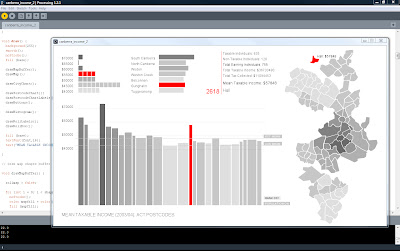
This visualisation is rather a set of linked visuaulisations, developed to provide analytic context and allow (encourage) the data to be approached from multiple points. The data set is 2003-04 average incomes by postcode compiled by the Australian Taxation Office, mashed up with a list of suburbs by postcode from wikipedia and a set of suburb boundaries which I traced myself.
 |
| Concentration of higher average incomes is clearly shown to be in older suburbs close to the centre |
 |
| Subsequent rings of suburbs have progressively lower average incomes further from the centre |
Mousing over a suburb in the map or a postcode in the main chart brings up a detailed information box which in addition to the figures from the data set lists the suburbs in that postcode.
I have additionally added two small analytic charts - a histogram showing the spread of postcodes by average income (there are only a couple with high averages) and a summary bar graph of average incomes by region. Both of these are also interactive and can be used to assist navigation - mousing over highlights all relevant postcodes in the main chart and in the map.
A consistent colour scheme has been used across all charts to allow intuitive reading of income concentration without needing to mouse over.
Together these charts encourage further exploration and reveal a richer narrative than any would individually - and are more informative for the mashed up additional data.
 |
| 2615 in West Belconnen is the only postcode below the Australian average |
 |
| Hall as a small village with it's own postcode is easily identified as an outlier |
 |
| All postcodes in South Canberra region highlighted showing range of average incomes between postcodes |
 |
| Income bar graph rearranged by rank without population weighting for width - no surprises the highest average incomes are in 2603 which covers Forrest and Red Hill |
However these visualisations are also a clear demonstration that no matter how neat the visualisation is, they are always constrained by the quality of the data. In this case, postcodes are not very fine grain. It would probably be much better to do the same visualisation with suburb or even street level data. For example Griffith is in the same postcode (2603) as Forrest and Red Hill but is not nearly as rich as Yarralumla. In West Belconnen (2615) there are some suburbs such as Flynn which would be much richer than suburbs such as Page and Scullin, which are in a postcode (2614) with rich suburbs such as Aranda and Weetangera. At a more zoomed in level it should be apparent that in suburbs such as Melba and Hawker there is a substantially richer end - on top of the hill. Canberra demographics are further mixed up anyway, with planning and social policies mixing public housing and units suitable for first home buyers throughout most suburbs.
Any data that summarises, makes averages etc should be read with caution - yet it is necessary to find patterns. Therefore a strategy of showing everything available, with as many different views and levels of zooming in, out and between as possible, must be pursued to ensure that data is read in appropriate context.
This is another project I have revisited in thinking about the project for the NMA collections. It is my most refined prototype of the analytic map as interface. Here I have visualised the data in multiple analytic ways simultaneously so that a user can have many hooks for exploration and easily locate individual data within the context of the whole data set. The suburb map and the summary bar graph of average incomes by region are examples of where appropriate mashed up additions can provide richer context than was immediately in the data set.
Sweet visualization, Pat. You can get somewhat finer grain, plus bonus shape files by using the ABS census CDs. That was what powered our visualization for AboutNSW, e.g. http://about.nsw.gov.au/view/choropleth/B111/
ReplyDeleteIirc there were some usage rights we had to negotiate. Backend processing scripts might even be open source... (great work by the interaction consortium foks on those).. I can find out if you'd like to know.
Hey thanks Dan. Great to know that is available.
ReplyDeleteDidn't know About NSW - fantastic site. Shame it wasn't continued.