Sunday, September 11, 2011

Data Visualisation - Canberra income by postcode

This is an October 2010 data visualisation project to develop prototype interactive charts undertaken as part of the Master of Digital Design.

Interactive Analytic Charts

This visualisation is rather a set of linked visuaulisations, developed to provide analytic context and allow (encourage) the data to be  approached from multiple points. The data set is 2003-04 average incomes by postcode compiled by the Australian Taxation Office, mashed up with a list of suburbs by postcode from wikipedia and a set of suburb boundaries which I traced myself.

Concentration of higher average incomes is clearly shown to be in older suburbs close to the centre
Subsequent rings of suburbs have progressively lower average incomes further from the centre
The main chart is a bar graph of average incomes by postcode - it is arranged by default by postcode, which relates approximately to the age of suburbs in that postcode, but can be arranged by average income rank. The population of each postcode was in the original data set and is indicated here by the width of the bars. This can be turned off, but is very useful for visually comprehending the scope of the data set. The chart also usefully has marked the Australia and Canberra wide averages.

Mousing over a suburb in the map or a postcode in the main chart brings up a detailed information box which in addition to the figures from the data set lists the suburbs in that postcode.

I have additionally added two small analytic charts - a histogram showing the spread of postcodes by average income (there are only a couple with high averages) and a summary bar graph of average incomes by region. Both of these are also interactive and can be used to assist navigation - mousing over highlights all relevant postcodes in the main chart and  in the map.

A consistent colour scheme has been used across all charts to allow intuitive reading of income concentration without needing to mouse over.

Together these charts encourage further exploration and reveal a richer narrative than any would individually - and are more informative for the mashed up additional data.

2615 in West Belconnen is the only postcode below the Australian average
Hall as a small village with it's own postcode is easily identified as an outlier
All postcodes in South Canberra region highlighted showing range of average incomes between postcodes
Income bar graph rearranged by rank without population weighting for width - no surprises the highest average incomes are in 2603 which covers Forrest and Red Hill
The visualisations show as expected that Red Hill and Forrest has the highest incomes. They also show clearly subsequent rings of decreasing average income - this is a text book diagram of most contemporary cities. I was pleased to discover outlying items such as how well off Hall was and that West Belconnen was the only postcode below the national average.

However these visualisations are also a clear demonstration that no matter how neat the visualisation is, they are always constrained by the quality of the data. In this case, postcodes are not very fine grain. It would probably be much better to do the same visualisation with suburb or even street level data. For example Griffith is in the same postcode (2603) as Forrest and Red Hill but is not nearly as rich as Yarralumla. In West Belconnen (2615) there are some suburbs such as Flynn which would be much richer than suburbs such as Page and Scullin, which are in a postcode (2614) with rich suburbs such as Aranda and Weetangera. At a more zoomed in level it should be apparent that in suburbs such as Melba and Hawker there is a substantially richer end - on top of the hill. Canberra demographics are further mixed up anyway, with planning and social policies mixing public housing and units suitable for first home buyers throughout most suburbs.

Any data that summarises, makes averages etc should be read with caution - yet it is necessary to find patterns. Therefore a strategy of showing everything available, with as many different views and levels of zooming in, out and between as possible, must be pursued to ensure that data is read in appropriate context.

This is another project I have revisited in thinking about the project for the NMA collections. It is my most refined prototype of the analytic map as interface. Here I have visualised the data in multiple analytic ways simultaneously so that a user can have many hooks for exploration and easily locate individual data within the context of the whole data set. The suburb map and the summary bar graph of average incomes by region are examples of where appropriate mashed up additions can provide richer context than was immediately in the data set.

Monday, September 5, 2011

The analytic map as interface

Proposal for this semester's Master of Digital Design project, which can be followed by the unit tag 8199.

I propose to build a simple analytic map to contextualise and make navigable in a browsable way the National Museum of Australia’s digital catalogue. Beginning with an overview and allowing zooming in to detailed tiles, maps assist the location and navigation of data by succinctly visualising complex relationships and structures. Additional context can be provided by simple analytic charts that further reveal relationships within data sets.

With the current online interface to the vast catalogue it is difficult to know where to begin browsing, it is impossible to comprehend the whole collection (scale, structure etc) and there is little context to an individual object.

My principles will be to start with viewing everything in a way that reveals structures and relationships to suggest themes to narrow viewing focus and filter the data set, and once viewing subsets or individual objects, provide context to locate them within the data set and suggest other related items to browse.

I don’t propose to build an interface such as this because I think it is particularly original – but because I am genuinely interested in personally exploring the NMA collection myself, and because I am curious to study how visualisation techniques scale.

A vast collection

The NMA collection is vast – both in total items (more than 200,000 objects) and in variety of content. On their website the NMA describes the themes of their collection as Aboriginal and Torres Strait Islander cultures and histories, Australian history and society since 1788 and people's interaction with the Australian environment, which are sufficiently broad to cover just about anything.

NMA's current online catalogue home page
NMA's object record view - often there is little information about the object or the collection it is a part of 
I previously observed that the online catalogue is not curated, and that most objects and collections are not given a contextual description that explains their significance. However the NMA does have a separate section of the website where recent acquisitions and the highlights of the collection listed under the three broad themes above are given significant contextual narrative documentation. Identifying and visualising this subset would be great as mashed up addition to an interface because it is in the Museum’s opinion the most interesting content, and more critically it is the most completely catalogued. It therefore might also be a useful home/landing page, particularly if the fully zoomed out view of the entire set is not legible.

Mitchell Whitelaw has been developing visualisations of similarly large and diverse data sets – the National Archives and Flickr Commons. Here ranking assists us to find top and bottom items, but unless already zoomed into a small subset, it can be difficult to locate middle items. Word clouds that visualise the most frequently used words in object titles, are useful in narrowing focus on content themes – Mitchell says that coverage can be between 75% and 95%, but there are outliers that are invisible. How do you locate these hidden objects?

Questions of organisation

I intend to organise browsing and zooming in around questions that I am personally interested in such as:
  • Which are the biggest/smallest objects? 
  • Which are the oldest objects? 
  • Which objects are there the most of? 
  • Which are the largest collections? 
Some questions that I would like to ask, but I doubt the public data set will have answers for, include:
  • Which objects are on exhibition? 
  • Which objects have never been on exhibition? 
  • Which objects are the most fragile? 
  • Which objects are currently the subjects of restoration work? 
  • Which records are newly added to the catalogue or have been recently updated? 
Finer grain filtering can be facilitated at the intersection of these questions – for example ‘show me old small objects’. I hope that using multiple filters in conjunction will help to find hidden objects.

Two data types that I suspect can provide interesting browsing links between collections are object material/s and associated location/s – both are linked from the current online catalogue records, but would be much more useful if they were visual and had an indication of quantity - for example ‘other objects associated with this location: 5’.

Ultimately I would love to end up with a unique visualisation. However I dont have anything particular in mind at the moment and am not going to try to think of something arbitrarily. I would like to let visualisations emerge from exploring the data. My plan is to start very simply, with what I have outlined above, and then let the data prompt subsequent questions.

A native of the web

After encouragement from Mitchell, I have decided that rather than work for most of the semester in Processing, where I am confident I could achieve a well resolved visual interface, it would be better to migrate early to native web formats that I have not worked previously with and risk less resolution but benefit from the significant challenge of learning and plugging together back end technical systems.

So I will need to translate from Processing to HTML5, CSS and JavaScript. Then I will need to ensure the large data set does not crash the browser, which can only work with limited memory. I suspect that I will have to set it up to load dynamically, which will require a MySQL database queried with PHP or Django. I am leaning toward using Django because it is built on Python, which I think I am likely to learn anyway in the future for Rhino 5 or other applications.

Ben Ennis Butler has suggested some clever potential work arounds for interactive web implementations of static visualisations (ie visualisations that dont require access to a database and are not redrawn dynamically), which I can fall back to if I get stuck. He did this for the histogram he designed to show the Australian prints collection at the National Gallery of Australia.

Ben Ennis Butler, histogram of Australian prints collection at NGA

This visualisation is exceptionally browsable and well suited to the scale of the collection. I am tempted to do a similar visualisation first as a test of how well it can work for a dataset the scale of the NMA collection.

Show everything

The 'show everything' approach has been advocated by Stamen, as well as Mitchell. The approach is to start with a view of everything and then zoom in and filter to subsets and individual items, facilitating a better comprehension of the scale of the entire data set and the position of an individual item within it and encouraging browsing by showing related items.

Stamen's SFMOMA Artscape does this very well, but only for a collection of 3,500 items.

SFMOMA Artscape by Stamen - zoomed out
SFMOMA Artscape by Stamen - zoomed in
Constructing the visualisation like a map with pre-generated tiles, the interface is slick. However this set up appears to limit dynamic rearrangement of tiles, leaving the user stuck with the preset ordering by acquisition date and not able to filter to a subset - searching or following keywords, artists etc allows you to zoom to items one at a time, but not able to see all subset items next to each other or skip ahead to particular items.

An interface for users

Finally, at the end of this project, if I have a working interface, I would like to do some user testing. Documenting how users explore the data would be a significant outcome that would assist developing design approaches to future visualisations, both in general terms and specific to the NMA collections.

Wednesday, August 31, 2011

myTram: a personalised Melbourne network map

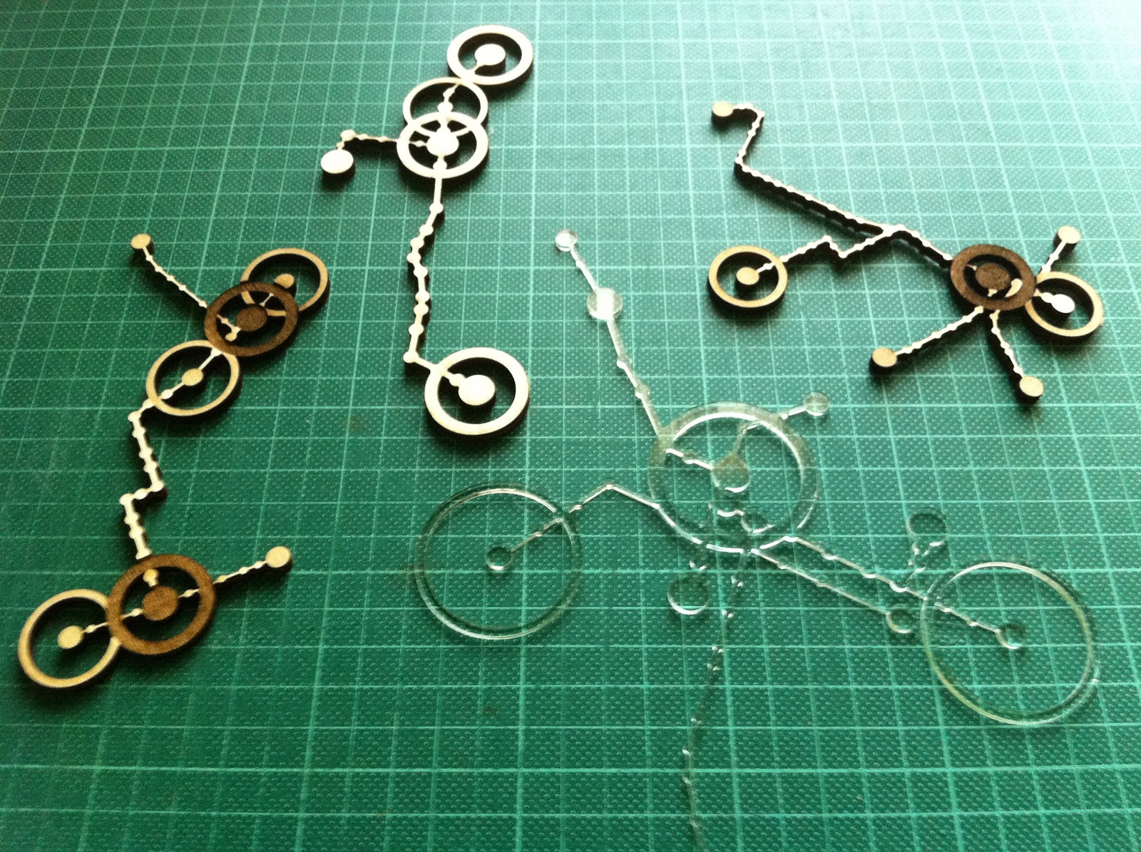
This is an October 2010 data visualisation project to develop a data form (object from data) that meaningfully interprets and embellishes the source data (the Melbourne tram network). The project was undertaken in collaboration with Kerrin Jefferies as part of the Master of Digital Design.

myTram data forms - laser cut/etched ply and perspex from Ponoko

Trams are critical in the definition of Melbourne urban form and culture as a primary and iconic mode of transport for inner city residents and visitors. Trams unlike trains follow the main streets, the tram network mirrors the principal geometries of the inner city grid and rotated CBD grid and as such is recognisable even to residents who do not use trams. Each route has distinct corners, bends, branches or kinks and so even a small portion of the network is identifiable.

Mapping personal use of the tram network - frequency and destination of trips, as well as the time spent at and walking range around destinations, gives a dataform that reveals substantially how the city is inhabited. As wearable jewellery or other intimate use object such as placemat or coaster, myTram is intensely personal and richly meaningful, able to prompt memory, discussion and movement from an intuitive and implicit understanding of the city to one that is more explicit.

GPS locations for each tram stop allowed accurately scaled drawing of stop locations which were matched with lists of stops on each route to approximately locate routes by drawing straight lines between stops. The route lists had misplaced stops which were removed by filtering for outlying distances between stops. As stops were located on both sides of the road and routes had travel in two directions there were selection interface issues that were exacerbated once myTrips and myStops were added. These issues were overcome with switches that could be toggled to narrow selection possibilities.

myTram interface - routes through Domain Interchange highlighted
myTram interface - myTrip Route 8 along Chapel St highlighted
myTram interface - editing time spent at and walk radius around myStops

While graphic representation on screen allowed relatively detailed information to be encoded with layered transparencies and fine lines, augmented with popups and rollovers, and navigated with filtering buttons, the laser cut data forms had to be significantly simplified to be legible. A thicker line weight was required for structural integrity and only two depths of etching were employed to ensure high contrast.

The final form was refined to just myTrips with no contextual information (grid and other routes were removed) and only two modes of trip frequency (frequent, thick line; and infrequent; thin line), time spent at myStops (primary, large radius and deep etch; and secondary, medium radius and shallow etch), and walk range around destination (greater than 500m, ring with 500m radius to scale; and less than 500m, no ring).

myTram is legible as an embellished section of a network diagram.

I reviewed this project again, now in the context of thinking about the project for the NMA collections, to remind myself of the importance of context when working with data. In this project the context is urban and personal, both rich and specific. The NMA data set is much larger and much of the context of individual objects I expect to be more ambiguous or abstract -  time, location, like items. I will have to be careful in drawing together any narrative that it is appropriate. 

Exploring the NMA catalogue - first thoughts

As part of the Master of Digital Design, this semester we will be developing data visualisation projects from the National Museum of Australia's digital catalogue. Project development can be followed with the tag 8199 (the unit number). The project is being led by Mitchell Whitelaw.

This is an exciting (and daunting) culmination of work to date. The NMA is in the process of digitally cataloguing it's very large and important collection (of collections). The NMA conserves the 'National Historical Collection' which contains more than 200,000 objects representing Australia's history and cultural heritage, of which so far 48,000 objects from 1003 collections have been catalogued. A tiny fraction of these objects make up the public exhibitions at the Museum - some of the exhibition material is valuable such as many of the indigenous artefacts, while some of it is perhaps not especially so but is important because it illustrates cultural stories (in one of the displays there is a windmill with a cut out magpie).

Phar Lap's Heart, National Museum
My first approaches to all of these objects online has me overwhelmed. Here there is no curation. I am confronted with a search box. Without having in mind something specific like Phar Lap's Heart I look to browse elsewhere. At the side there is a random selection of object thumbnails (many of the objects dont have photos, and most of them appear to be low resolution). Initially I didnt realise that these were links, but they were all the same engaging. Next there was the opportunity to browse by object type - this I found to be the most interesting - cabinets, cake tins, canoes, chemical jars, cricket balls, cut throat razors... Then there was the opportunity to browse by collection - here I was confronted by many unfamiliar names that I assumed to be donors or the focus of the collection. Unfortunately I couldn't access a description of the collection, only a list of the objects it included. Elsewhere on the NMA website I found descriptions of some of the most significant collections.

Examination of individual object records left me feeling no better connected to the material of the collections. Each item that I viewed (except Phar Lap's Heart) had a very brief factual description of the object, but little contextual information other than a date and place. I could not tell what the significant of the object was (surely some of the objects are more significant than others?) and I was not told why it was part of the National Historical Collection.

So the task I am most interested in is constructing a better narrative around these objects. Data items that stand out as possibilities to construct some analytic context are date, place, materials, dimensions, collection size and number of object type. It is my expectation that visualisations based on these data items can better situate oneself within the collection and assist navigation / browsing. It is my intention to make both visualisations of and an interface to the collection.

The designed ability to zoom in and out within a dataset and to comprehend the scale of the whole and it's parts allows large and complex data that was previously only superficially understood to become powerful and sophisticated information tools. Of course data analysis is only as valid as the source data and data can be misunderstood when it is out of context - or in a wrong or partial context.

Mitchell Whitelaw's visualisation project for the National Archives is a great demonstration of the potential for design to transform the accessibility and legibility of a large data set that was previously incomprehensible. The overview Series Browser is able to represent the entire data set of series in a way that reveals structure and relationships, while the zoomed in A1 Explorer uses a word frequency cloud and histogram to indicate some of the contents in a more succinct and engaging way than a contents or index page possibly could (the A1 series contains 65,000 items). Both visualisations suggest themes to focus or zoom further in on - and being interactive are part analytic, map and interface.

National Archives Series Browser, Mitchell Whitelaw, 2010 - series are arranged
chronologically with their size and provenance indicated

Friday, July 15, 2011

D, I & E Tile Processing Mockup V3

Is this the winning formula? Finally I have a balanced version that has multiple pressure input legible and allows emergent pattern. I have added a lock out that stops endless cycling after a reasonable time to see emergence (15 sec) if a low gate condition has been reached (lights on 3 times in that 15 sec). During a lock out period (10 sec) I imagine pressure input would result in a low buzz to indicate it was disabled.

I have kept the min off time to a minimum to maximise feedback from pressure input, and increased the flag delay and limited the max on time to ensure not all lights are on at the same time. Also I think mode 2, clockwise internal communication arrangement, is most coherent to use, because the communication between tiles is clockwise. Controls are still enabled - so keep playing!


Monday, May 30, 2011

D, I & E Tile Processing Mockup V2

Here is a revised version with controls to change variables so that everyone can have a bit of a play.

I have added the potential to set a minimum time that cells must be off before they can be turned on by neighbouring cells being on. This can be used to break the endless cycle and makes responses and interactions from simultaneous pressure sensor inputs at opposite sides of the board more legible. Unfortunately pressure sensor inputs can not be communicated to neighbouring cells that are serving a minimum time off (this is possible to code, but our physical communication setup can not differentiate the cause of neighbouring cells' lights being on). There is also then the potential to set a maximum time that cells can be off before they randomly turn themselves on.

I am not sure what the optimum arrangement is for our installation, and if it would be interesting or too unintelligible for each tile to have individual settings. So keep playing!


Sunday, May 29, 2011

D, I & E Tile Processing Mockup

Here is a quick Processing mockup of our current tile arrangement to demonstrate that lights are communicated in circles. I have also tested some alternative arrangements that produce various other emergent patterns, such as diagonal stripes, by communicating between cells within tiles. All of the arrangements produce endless loops from a single pressure sensor input, but unfortunately in all of the arrangements multiple pressure sensor inputs produce either no legible response or fairly uninteresting interactions.


Controls:
mouse click = pressure sensor input / footstep (to begin)
key q = turn all lights off
key 1 = only neighbouring tiles (current arrangement)
key 2 = neighbouring tiles plus internal cells clockwise
key 3 = neighbouring tiles plus internal cells anti-clockwise
key 4 = neighbouring tiles plus internal cells diagonal
key 5 = neighbouring tiles plus all internal cells
key 6 = neighbouring tiles plus internal cells horizontal
key 7 = neighbouring tiles plus internal cells vertical