Showing posts with label canberra. Show all posts

Tuesday, October 4, 2011

Interactive word frequency cloud

Following the data visualisation unit, I was lucky enough to have the opportunity to work over summer as a research assistant for Andrew MacKenzie to develop a tool to explore survey responses from residents, architects and builders who had rebuilt in Duffy after the 2003 Canberra bushfires. The word cloud was built with supervision from Mitchell Whitelaw and is based on code he developed for the A1 Explorer.

Word frequency cloud (architects only, responses to all questions)  with substantial control panel  for filtering at right
Word frequency cloud with correlations to 'wanted' highlighted and all occurrences of 'wanted'  listed on right
The data can be filtered by response to particular questions, the category of respondent (resident who rebuilt, new resident, architect, builder etc) and individual respondent - so it is possible to see a cloud of everything or  any subgroup of responses or an individual response. A list of standard 'stop' words  and any words with less than 3 characters have been removed. Further words can be added to an exclusion list, by clicking, which is helpful to look beyond boring words or extremely frequent words that can obscure differentiation between less frequent words.

All of these filtering options end up in a large control panel, which took a bit of juggling to fit on screen. It may have been neater to hide it in drop down  or pop up menus. However I think it was important to highlight the current view position within in the entire data set.

Mousing over a word highlights corresponding words that occur in proximity and brings up a scrollable list of all occurrences of the highlighted word in fragmentary context of the five words pre and post it.

An appropriate way to understand and navigate data?

So this is another example of a show everything and zoom in visualisation. However the reason I posted it is primarily to make a brief observation about the appropriateness of visualisation techniques to understand/navigate data. A distinction between understanding and navigation is perhaps important.

In the case of Mitchell Whitelaw's A1 Explorer the word cloud visualises item titles in the National Archives A1 Series. Titles generally are specific and succinct, and considered. The A1 Explorer is a visualisation that reveals some of the topics and relationships in the series, but it is also an interface to the digitised items themselves.

Similarly a word cloud of a carefully crafted speech, such as Obama's inauguration speech, reveals succinctly some of the themes. It is probable that some speeches are written with word cloud analysis in mind. Political rhetoric noticeably employs frequently repeated, memorable, mantras. Of course, as Jodi Dean writes, a word cloud is in many ways a very superficial analysis that ignores sentences, stories and narratives.

A different example, designed specifically for visualisation as a word cloud, was curated by the ABC who to mark Julia Gillard's first year as Prime Minister called for the public to submit 3 words that characterise their perceptions of Gillard and also of opposition leader Tony Abbot. Not surprisingly the most frequently submitted words aligned closely with the rhetoric that had been most prominent in the media.

Even if visualising words by themselves are appropriate, a critical challenge for word clouds and like visualisation techniques is to be able to locate the small, hidden, items, because they are perhaps the most interesting or important. It might be that quantitative data analysis can only ever take us so far, and that curation is necessary to go beyond? However when it comes to big data, quantitative might be our only way  in - a starting point for exploration.

Andrew MacKenzie has said that the word clouds were very helpful as a research tool and their revelations support his observations during and other analysis subsequent to the interviews. My feeling is that there was substantial noise because of the nature of the raw survey data. The responses were not carefully crafted like an Obama speech or considered even like a title or a 3 word perception of Gillard - they were spontaneous and people thought as they spoke. The word cloud doesn't distinguish initial response from more considered closing summary remark. It doesn't take account of rambles, tangents or emphasis placed on particular ideas. That said the quantitative analysis also ignores any bias the researcher might have had in looking for particular ideas.

Sunday, September 11, 2011

Data Visualisation - Canberra income by postcode

This is an October 2010 data visualisation project to develop prototype interactive charts undertaken as part of the Master of Digital Design.

Interactive Analytic Charts

This visualisation is rather a set of linked visuaulisations, developed to provide analytic context and allow (encourage) the data to be  approached from multiple points. The data set is 2003-04 average incomes by postcode compiled by the Australian Taxation Office, mashed up with a list of suburbs by postcode from wikipedia and a set of suburb boundaries which I traced myself.

Concentration of higher average incomes is clearly shown to be in older suburbs close to the centre
Subsequent rings of suburbs have progressively lower average incomes further from the centre
The main chart is a bar graph of average incomes by postcode - it is arranged by default by postcode, which relates approximately to the age of suburbs in that postcode, but can be arranged by average income rank. The population of each postcode was in the original data set and is indicated here by the width of the bars. This can be turned off, but is very useful for visually comprehending the scope of the data set. The chart also usefully has marked the Australia and Canberra wide averages.

Mousing over a suburb in the map or a postcode in the main chart brings up a detailed information box which in addition to the figures from the data set lists the suburbs in that postcode.

I have additionally added two small analytic charts - a histogram showing the spread of postcodes by average income (there are only a couple with high averages) and a summary bar graph of average incomes by region. Both of these are also interactive and can be used to assist navigation - mousing over highlights all relevant postcodes in the main chart and  in the map.

A consistent colour scheme has been used across all charts to allow intuitive reading of income concentration without needing to mouse over.

Together these charts encourage further exploration and reveal a richer narrative than any would individually - and are more informative for the mashed up additional data.

2615 in West Belconnen is the only postcode below the Australian average
Hall as a small village with it's own postcode is easily identified as an outlier
All postcodes in South Canberra region highlighted showing range of average incomes between postcodes
Income bar graph rearranged by rank without population weighting for width - no surprises the highest average incomes are in 2603 which covers Forrest and Red Hill
The visualisations show as expected that Red Hill and Forrest has the highest incomes. They also show clearly subsequent rings of decreasing average income - this is a text book diagram of most contemporary cities. I was pleased to discover outlying items such as how well off Hall was and that West Belconnen was the only postcode below the national average.

However these visualisations are also a clear demonstration that no matter how neat the visualisation is, they are always constrained by the quality of the data. In this case, postcodes are not very fine grain. It would probably be much better to do the same visualisation with suburb or even street level data. For example Griffith is in the same postcode (2603) as Forrest and Red Hill but is not nearly as rich as Yarralumla. In West Belconnen (2615) there are some suburbs such as Flynn which would be much richer than suburbs such as Page and Scullin, which are in a postcode (2614) with rich suburbs such as Aranda and Weetangera. At a more zoomed in level it should be apparent that in suburbs such as Melba and Hawker there is a substantially richer end - on top of the hill. Canberra demographics are further mixed up anyway, with planning and social policies mixing public housing and units suitable for first home buyers throughout most suburbs.

Any data that summarises, makes averages etc should be read with caution - yet it is necessary to find patterns. Therefore a strategy of showing everything available, with as many different views and levels of zooming in, out and between as possible, must be pursued to ensure that data is read in appropriate context.

This is another project I have revisited in thinking about the project for the NMA collections. It is my most refined prototype of the analytic map as interface. Here I have visualised the data in multiple analytic ways simultaneously so that a user can have many hooks for exploration and easily locate individual data within the context of the whole data set. The suburb map and the summary bar graph of average incomes by region are examples of where appropriate mashed up additions can provide richer context than was immediately in the data set.

Monday, September 5, 2011

The analytic map as interface

Proposal for this semester's Master of Digital Design project, which can be followed by the unit tag 8199.

I propose to build a simple analytic map to contextualise and make navigable in a browsable way the National Museum of Australia’s digital catalogue. Beginning with an overview and allowing zooming in to detailed tiles, maps assist the location and navigation of data by succinctly visualising complex relationships and structures. Additional context can be provided by simple analytic charts that further reveal relationships within data sets.

With the current online interface to the vast catalogue it is difficult to know where to begin browsing, it is impossible to comprehend the whole collection (scale, structure etc) and there is little context to an individual object.

My principles will be to start with viewing everything in a way that reveals structures and relationships to suggest themes to narrow viewing focus and filter the data set, and once viewing subsets or individual objects, provide context to locate them within the data set and suggest other related items to browse.

I don’t propose to build an interface such as this because I think it is particularly original – but because I am genuinely interested in personally exploring the NMA collection myself, and because I am curious to study how visualisation techniques scale.

A vast collection

The NMA collection is vast – both in total items (more than 200,000 objects) and in variety of content. On their website the NMA describes the themes of their collection as Aboriginal and Torres Strait Islander cultures and histories, Australian history and society since 1788 and people's interaction with the Australian environment, which are sufficiently broad to cover just about anything.

NMA's current online catalogue home page
NMA's object record view - often there is little information about the object or the collection it is a part of 
I previously observed that the online catalogue is not curated, and that most objects and collections are not given a contextual description that explains their significance. However the NMA does have a separate section of the website where recent acquisitions and the highlights of the collection listed under the three broad themes above are given significant contextual narrative documentation. Identifying and visualising this subset would be great as mashed up addition to an interface because it is in the Museum’s opinion the most interesting content, and more critically it is the most completely catalogued. It therefore might also be a useful home/landing page, particularly if the fully zoomed out view of the entire set is not legible.

Mitchell Whitelaw has been developing visualisations of similarly large and diverse data sets – the National Archives and Flickr Commons. Here ranking assists us to find top and bottom items, but unless already zoomed into a small subset, it can be difficult to locate middle items. Word clouds that visualise the most frequently used words in object titles, are useful in narrowing focus on content themes – Mitchell says that coverage can be between 75% and 95%, but there are outliers that are invisible. How do you locate these hidden objects?

Questions of organisation

I intend to organise browsing and zooming in around questions that I am personally interested in such as:
  • Which are the biggest/smallest objects? 
  • Which are the oldest objects? 
  • Which objects are there the most of? 
  • Which are the largest collections? 
Some questions that I would like to ask, but I doubt the public data set will have answers for, include:
  • Which objects are on exhibition? 
  • Which objects have never been on exhibition? 
  • Which objects are the most fragile? 
  • Which objects are currently the subjects of restoration work? 
  • Which records are newly added to the catalogue or have been recently updated? 
Finer grain filtering can be facilitated at the intersection of these questions – for example ‘show me old small objects’. I hope that using multiple filters in conjunction will help to find hidden objects.

Two data types that I suspect can provide interesting browsing links between collections are object material/s and associated location/s – both are linked from the current online catalogue records, but would be much more useful if they were visual and had an indication of quantity - for example ‘other objects associated with this location: 5’.

Ultimately I would love to end up with a unique visualisation. However I dont have anything particular in mind at the moment and am not going to try to think of something arbitrarily. I would like to let visualisations emerge from exploring the data. My plan is to start very simply, with what I have outlined above, and then let the data prompt subsequent questions.

A native of the web

After encouragement from Mitchell, I have decided that rather than work for most of the semester in Processing, where I am confident I could achieve a well resolved visual interface, it would be better to migrate early to native web formats that I have not worked previously with and risk less resolution but benefit from the significant challenge of learning and plugging together back end technical systems.

So I will need to translate from Processing to HTML5, CSS and JavaScript. Then I will need to ensure the large data set does not crash the browser, which can only work with limited memory. I suspect that I will have to set it up to load dynamically, which will require a MySQL database queried with PHP or Django. I am leaning toward using Django because it is built on Python, which I think I am likely to learn anyway in the future for Rhino 5 or other applications.

Ben Ennis Butler has suggested some clever potential work arounds for interactive web implementations of static visualisations (ie visualisations that dont require access to a database and are not redrawn dynamically), which I can fall back to if I get stuck. He did this for the histogram he designed to show the Australian prints collection at the National Gallery of Australia.

Ben Ennis Butler, histogram of Australian prints collection at NGA

This visualisation is exceptionally browsable and well suited to the scale of the collection. I am tempted to do a similar visualisation first as a test of how well it can work for a dataset the scale of the NMA collection.

Show everything

The 'show everything' approach has been advocated by Stamen, as well as Mitchell. The approach is to start with a view of everything and then zoom in and filter to subsets and individual items, facilitating a better comprehension of the scale of the entire data set and the position of an individual item within it and encouraging browsing by showing related items.

Stamen's SFMOMA Artscape does this very well, but only for a collection of 3,500 items.

SFMOMA Artscape by Stamen - zoomed out
SFMOMA Artscape by Stamen - zoomed in
Constructing the visualisation like a map with pre-generated tiles, the interface is slick. However this set up appears to limit dynamic rearrangement of tiles, leaving the user stuck with the preset ordering by acquisition date and not able to filter to a subset - searching or following keywords, artists etc allows you to zoom to items one at a time, but not able to see all subset items next to each other or skip ahead to particular items.

An interface for users

Finally, at the end of this project, if I have a working interface, I would like to do some user testing. Documenting how users explore the data would be a significant outcome that would assist developing design approaches to future visualisations, both in general terms and specific to the NMA collections.

Wednesday, August 31, 2011

Exploring the NMA catalogue - first thoughts

As part of the Master of Digital Design, this semester we will be developing data visualisation projects from the National Museum of Australia's digital catalogue. Project development can be followed with the tag 8199 (the unit number). The project is being led by Mitchell Whitelaw.

This is an exciting (and daunting) culmination of work to date. The NMA is in the process of digitally cataloguing it's very large and important collection (of collections). The NMA conserves the 'National Historical Collection' which contains more than 200,000 objects representing Australia's history and cultural heritage, of which so far 48,000 objects from 1003 collections have been catalogued. A tiny fraction of these objects make up the public exhibitions at the Museum - some of the exhibition material is valuable such as many of the indigenous artefacts, while some of it is perhaps not especially so but is important because it illustrates cultural stories (in one of the displays there is a windmill with a cut out magpie).

Phar Lap's Heart, National Museum
My first approaches to all of these objects online has me overwhelmed. Here there is no curation. I am confronted with a search box. Without having in mind something specific like Phar Lap's Heart I look to browse elsewhere. At the side there is a random selection of object thumbnails (many of the objects dont have photos, and most of them appear to be low resolution). Initially I didnt realise that these were links, but they were all the same engaging. Next there was the opportunity to browse by object type - this I found to be the most interesting - cabinets, cake tins, canoes, chemical jars, cricket balls, cut throat razors... Then there was the opportunity to browse by collection - here I was confronted by many unfamiliar names that I assumed to be donors or the focus of the collection. Unfortunately I couldn't access a description of the collection, only a list of the objects it included. Elsewhere on the NMA website I found descriptions of some of the most significant collections.

Examination of individual object records left me feeling no better connected to the material of the collections. Each item that I viewed (except Phar Lap's Heart) had a very brief factual description of the object, but little contextual information other than a date and place. I could not tell what the significant of the object was (surely some of the objects are more significant than others?) and I was not told why it was part of the National Historical Collection.

So the task I am most interested in is constructing a better narrative around these objects. Data items that stand out as possibilities to construct some analytic context are date, place, materials, dimensions, collection size and number of object type. It is my expectation that visualisations based on these data items can better situate oneself within the collection and assist navigation / browsing. It is my intention to make both visualisations of and an interface to the collection.

The designed ability to zoom in and out within a dataset and to comprehend the scale of the whole and it's parts allows large and complex data that was previously only superficially understood to become powerful and sophisticated information tools. Of course data analysis is only as valid as the source data and data can be misunderstood when it is out of context - or in a wrong or partial context.

Mitchell Whitelaw's visualisation project for the National Archives is a great demonstration of the potential for design to transform the accessibility and legibility of a large data set that was previously incomprehensible. The overview Series Browser is able to represent the entire data set of series in a way that reveals structure and relationships, while the zoomed in A1 Explorer uses a word frequency cloud and histogram to indicate some of the contents in a more succinct and engaging way than a contents or index page possibly could (the A1 series contains 65,000 items). Both visualisations suggest themes to focus or zoom further in on - and being interactive are part analytic, map and interface.

National Archives Series Browser, Mitchell Whitelaw, 2010 - series are arranged
chronologically with their size and provenance indicated

Monday, December 13, 2010

Reflections on Generic City

Performance night was successful and a lot of fun (see photos following). Many thanks to Mitchell Whitelaw for organising the project and superb guidance throughout.

Generic City C8 - performance night, photographer Mitchell Whitelaw
Not such a generic audience...
Picnic rug on kerb side?
Refining after the dry run, I developed a tool to set, remember and edit where windows are, and so was able to make growth avoid windows. This worked very smoothly (although it was a little cumbersome to edit using arrow keys) and was a great visual improvement on the untidiness of the dry run. 

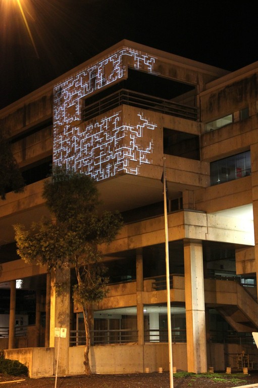
Also after the dry run, I slowed the growth rate and increased the range of growth speeds, but perhaps could have gone further - I was trying to balance against speed to show at a glance the dynamic and iterative quality. On the night in response to feedback I did in fact slow it down further. Mitchell described the generated cities as having an elusive quality - just as soon as they were fully grown they disappeared, and because you never knew when they were fully grown and therefore about to disappear, it was impossible to photograph! Mitchell's very nice suggestion was to pause before disappearing and then fade in transition. 

This got me thinking about other ways to improve legibility. As each frame many cells can grow and as each cell can have many children or branches, it quickly becomes difficult to follow new growth. Perhaps I could have more tightly controlled growth by keeping track of a cell's age since it last grew and limiting future growth in this way, or by limiting number of children or branching so that growth is more linear - I didnt consider limiting branching previously because I was only thinking about density which I controlled by number of neighbours.

Further it might be interesting to trace pathways through the city or highlight precincts defined for example by blocks serviced by particular streets, blocks adjoining particular public squares or neighborhoods of the same block type. This would assist in reading the structure of the city.

On the performance night it was again abundantly clear that the simplest geometries were the most striking and legible at this scale. Perhaps, against what I wrote previously, this is cause to extend a shape grammar with little variance and highly structured relationships endlessly across the facade. Perhaps a Cameron Offices or other John Andrews skin, or even a skin based on the Nolli Plan of Rome would have been really effective. This is a lesson about misjudgment, a reminder to test often and early.

The most significant difference between Generic City and a potential John Andrews shape grammar is that Generic City has non-deterministic relationships adding an exciting additional layer of complexity - that of allowing emergent orders, simply from interactions between neighbouring cells. Harnessing emergence better simulates organic city growth, accommodating multiple competing forces, and so makes for the beginnings of a potentially powerful analytical or design tool.

One final loose end, I previously suggested making Generic City interactive. I never pursued this because I judged that apart from conditions that changed the speed of growth or events that terminated a city and began a new one it would be difficult to make the interactivity legible - what condition could legibly control block type for instance? Further any interaction would potentially clash with internal growth imperatives, making the underlying system more difficult to read.

This project is principally concerned with exploring a generative system and grounding it by the interpretive content: tectonic dressing of structure, articulating surface and fenestration; generative system as emphasis of the architecture as system; networked city precinct to reveal the seeds for a greater whole contained within a single building; an iterative production to imply the conflation of past, future and alternate realities. It is critical that the system is legible.

Generic City C8 - performance night, photographer Mitchell Whitelaw

Extending John Andrews - a shape grammar?

One part of my early proposal, that I have mulled over for sometime but never pursued, was for a generative cityscape that remixed the geometry of Cameron Offices and other John Andrews or exemplar modern architectures. 

I created a Generic City and continued refining it, while holding off on fitting a  shape grammar to it as a skin. While it should be possible with a small amount of adaption to plug in almost any simple geometry (including non-orthogonal geometry by switching back to an 'off-lattice' Eden Growth Model which would require a different method of locating neighbouring cells), I felt that a shape grammar skin could be deterministic with highly structured relationships and that the open-ended further abstracted generic geometry was perhaps more robust in generating differentiation.

When for example I was considering a shape grammar for the Cameron Offices, I was immediately stuck with a couple of problems. All of the offices are oriented E-W to reduce direct sunlight (early morning / late afternoon). If I was to extend this endlessly it would be pretty boring - monotonous. This is the first problem - that Andrews did not design for variation: he designed in fixed modules (in a time before the changed economies of digital fabrication). Perhaps it would have been interesting to abstract further John Andrews grammar and introduce limited variance - but would this be true to Andrews? Probably I should have conceived this as an updating of his geometry appropriate for this time, that could be true if it didnt break any fundamental rules - whatever they might be. For example maybe I could decide that E-W orientation is not fundamental, but shading is - however if I introduced N-S orientation then I would have to design new shading and a way of turning corners. This is the second problem, I would have to design - the Cameron Offices does not have all of the information required for a shape grammar of an entire city, it is only a piece. 

Andrews clearly understood his projects as systems or networks, designing them to be extended and connected with other projects. However the extensions he considered, for example the Bellmere Public School (see below), were a couple of additional modules. Andrews I doubt would intend the same geometry, even with minor variance, to be extended endlessly - particularly across different programs. This is made clear with the interface/connections at the boundaries of the Cameron Offices where Andrews designed pedestrian bridges to connect with housing but did not indicate any geometry or even massing for the housing, and further where he did sketch a town square and retail centre adjacent on the North the geometry is manifestly distinct. This principle is further reinforced later by the Bus Interchange where Andrews makes the pedestrian circulation circular tubes - a more obvious contrast to the adjacent Cameron Offices is not imaginable.

John Andrews, Cameron Offices, site plan from 'Australian Architecture Since 1960', 2nd Edition, 1990, Jennifer Taylor

John Andrews, Cameron Offices and Belconnen Bus Interchange, Canberra,  photo from 'John Andrews: Architecture a Performing Art' 1982, Jennifer Taylor & John Andrews
Andrews shows how to make connections (pedestrian bridges), but as to what to connect to - well this could be almost any geometry. To illustrate the variety of Andrews geometries, and as a reminder of how significant an architect he has been, following is a selection of potential shape grammar seeds. Ultimately I felt that if I was designing I wanted it to be legible that it was my hand not Andrews and so I stayed with the generic geometry. Of course in the sense that Generic City is a system it is still closely associated with Andrews.

John Andrews, Scarborough College, University of Toronto, plan from 'John Andrews: Architecture a Performing Art' 1982, Jennifer Taylor & John Andrews
John Andrews, Scarborough College, University of Toronto, photo from 'John Andrews: Architecture a Performing Art' 1982, Jennifer Taylor & John Andrews
John Andrews, Bellmere Public School, Toronto, plan from 'John Andrews: Architecture a Performing Art' 1982, Jennifer Taylor & John Andrews
John Andrews, Bellmere Public School, Toronto, elevation from 'John Andrews: Architecture a Performing Art' 1982, Jennifer Taylor & John Andrews
John Andrews, Guelph University (Ontario) student residences, plan from 'John Andrews: Architecture a Performing Art' 1982, Jennifer Taylor & John Andrews
John Andrews, Guelph University (Ontario) student residences, photo from 'John Andrews: Architecture a Performing Art' 1982, Jennifer Taylor & John Andrews
John Andrews, African Place, Expo '67, axonometric plan from 'John Andrews: Architecture a Performing Art' 1982, Jennifer Taylor & John Andrews
John Andrews, African Place, Expo '67, photo from 'John Andrews: Architecture a Performing Art' 1982, Jennifer Taylor & John Andrews
John Andrews, Miami Port Passenger Terminal, section diagram from 'John Andrews: Architecture a Performing Art' 1982, Jennifer Taylor & John Andrews
John Andrews, Miami Port Passenger Terminal, photo from 'John Andrews: Architecture a Performing Art' 1982, Jennifer Taylor & John Andrews
John Andrews, The Canadian National (CN) Tower,  Toronto, photo from 'John Andrews: Architecture a Performing Art' 1982, Jennifer Taylor & John Andrews
John Andrews, Gund Hall studios, Harvard Graduate School of Design, photo from 'John Andrews: Architecture a Performing Art' 1982, Jennifer Taylor & John Andrews
John Andrews, Gund Hall studios, Harvard Graduate School of Design, section from 'John Andrews: Architecture a Performing Art' 1982, Jennifer Taylor & John Andrews
John Andrews, King George Tower, Sydney, photo from 'John Andrews: Architecture a Performing Art' 1982, Jennifer Taylor & John Andrews
John Andrews, Toad Hall student residences, Australian National University (ANU), plan from 'John Andrews: Architecture a Performing Art' 1982, Jennifer Taylor & John Andrews


John Andrews, Toad Hall student residences, Australian National University (ANU), photo from 'John Andrews: Architecture a Performing Art' 1982, Jennifer Taylor & John Andrews
John Andrews, New Res student residences, University of Canberra, unit plan from 'John Andrews: Architecture a Performing Art' 1982, Jennifer Taylor & John Andrews


John Andrews, New Res student residences, University of Canberra, photo from 'John Andrews: Architecture a Performing Art' 1982, Jennifer Taylor & John Andrews
John Andrews, Callum Offices, Woden, Canberra, site plan from 'John Andrews: Architecture a Performing Art' 1982, Jennifer Taylor & John Andrews
John Andrews, Callum Offices, Woden, Canberra, photo from 'John Andrews: Architecture a Performing Art' 1982, Jennifer Taylor & John Andrews
John Andrews, House at Eugowra (near Parkes), NSW, photo from 'John Andrews: Architecture a Performing Art' 1982, Jennifer Taylor & John Andrews

Monday, November 15, 2010

Projection mapping Cameron Offices - cause to redefine the project

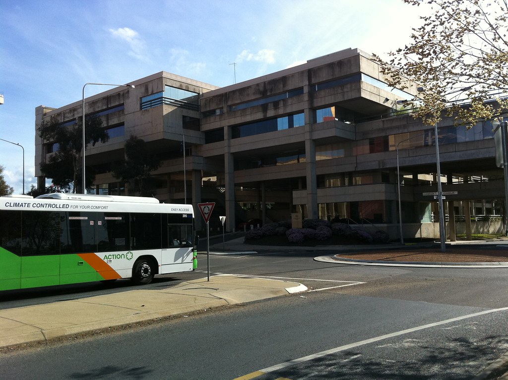
A few things to update. We have chosen a site - it is a complicated corner of Cameron Offices, which will test our skills in projection mapping.

Our site, the corner with the window just above the bus
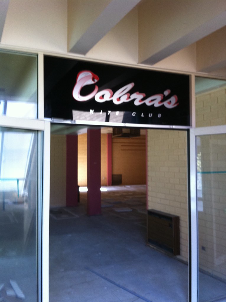
Cobra's, the abandoned 1980s night club we discovered
Cobra's has a conveniently located window to project from
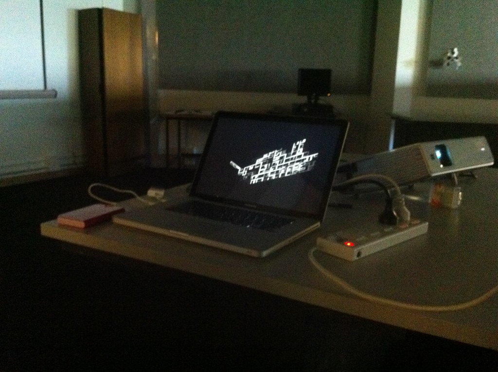
I could not find a good definition of projection mapping online to link to. The term essentially covers techniques to map a 2d projection to the features of the buildings and infrastructure, the surfaces, that are being projected on to - ie to account for fenestrations and perspective. We will be using David Bouchard's Keystone library for Processing which will allow us to quickly map on site.

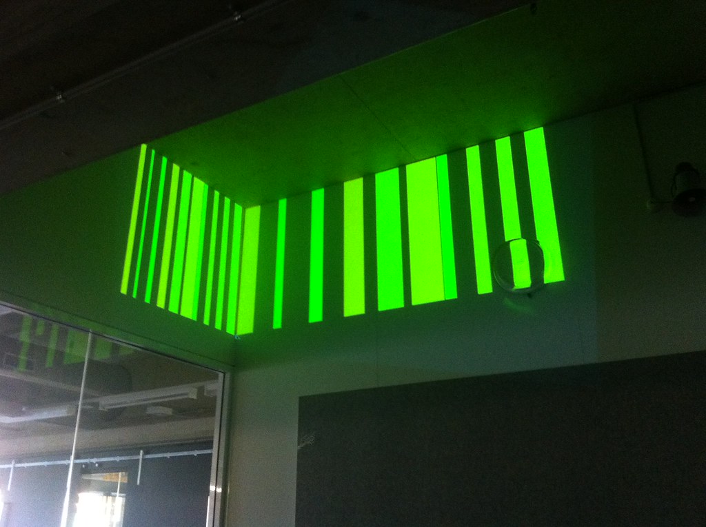
Mitchell's demonstration of Keystone
Mitchell demonstrating Keystone
Given that we have now confirmed that we are projecting on a corner and around windows, as opposed to a flat surface, I have decided to leave behind the ideas of montage, which were conceived as singular images best understood if viewed in their entirety.

This leaves the generated cityscape of remixed geometry as the project focus, and within in that set of ideas the Nolli like plans of public space because they can grow organically in any direction seem best suited to fit around windows and other features. Perhaps the growth can avoid windows or begin from corners and edges. So this is the new direction, which, as shown below, is already working well with Keystone even in it's most initial prototypical form.
Generic City A2 with Keystone can seamlessly wrap around corners
Generic City Growth A2 with Keystone showing on screen distortion