This is a proposal for an interpretive light projection art installation at the partly demolished Cameron Offices. As I wrote in a
previous post, the modern architectural masterpiece has been misunderstood and unappreciated, and this project is an opportunity to encourage a new public engagement with the important building.
The intention is to generate a series of photomontages that emphasise the powerful sublime of modern architecture's allusion to ruin, and explore the structural and compositional geometries expressive of this and the ideological urban ordering of public space, landscape and network connections, that is particularly inherent in the Cameron Offices. This perhaps connects to the zeitgeist interest with city form amid contemporary concern about population growth and climate change.
Theoretical Position
Modern architecture alludes to ruin through its expressed structure and lack of ornamentation. The Cameron Offices, by virtue of having never been connected to its intended broader urban network and then by its now partly demolished nature, is a fragment that requires the imagination of what might have been. This allusion to something greater is how the sublime functions, as Edmund Burke and Immanuel Kant determine, and why ruins are sublime.
 |
| Giovanni Piranesi, Il Campo Marzio dell' Antica Roma, Second Frontispiece |
Manfredo Tafuri in examining utopias through a discussion of Giovanni Piranesi's Campo Marzio demonstrates that excess can reveal truth. Here the 'struggle between architecture and the city, between the demand for order and the will to formlessness, assumes epic tone' and points to 'no other possibility than that of global, voluntary alienation in collective form... a place of total disorder' (Manfredo Tafuri,
Architecture and Utopia: Design and Capitalist Development).
 |
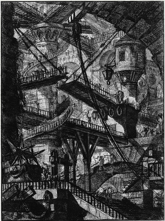
| Giovanni Piranesi, Carceri d'Invenzione, Plate VII (The Drawbridge) |
With other Piranesi drawings, such as his Carceri d'Invenzione (imaginary prisons) series, ambiguity as well as dramatisation and exaggeration contribute to their theatricality.
Gevork Hartoonian proposes ideas of the tectonic and theatricality developed from Gottfried Semper to centre a critical practice within the contemporary culture of spectacle that foregrounds hollow image-making and commodity fetishism. The tectonic, which distinguishes architecture from building, is the purposeful articulation of the relationship between construction (core form) and dressing (art form), and it is this excess that is theatrical - while an art form or image that has no relation to the core form is simply spectacle. See Hal Foster's essay
Image Building for a critique of the image-making tendencies of the contemporary architectural avant garde.
Hartoonian suggests that the idea of montage, or the cut, can be used as a critical tool by architects to repress spectacle, and that through cutting, theatricality is activated by the need to think to approach perception of the whole. Hartoonian's writings on theatricality can be found in
Crisis of the Object.
This proposal and discussion also recalls Walter Benjamin's wish images that blur dreams and reality, particularly the past or future with the present. The Cameron Offices presents a wish image in that it is now a partly demolished historical fragment but also in that it is a ruin of unrealised ambition. Despite (or perhaps because of) the failure of the modern project, ideologies that point to unattainable ideals are alluring.
Precedent Work
This proposal is indebted to the inspirational photomontages of Beate Gutschow, particularly her S series which I saw exhibited a couple of years ago at the Museum of Contemporary Photography (
MoCP) in Chicago. In the S series, fragments of modern architecture are composited out of context in a landscape of vastness where no totality is perceivable to emphasise the sublime and theatrical.
 |
| Beate Gutschow, S#14 |
Along similar lines to Tafuri's discussion of utopia, Philip Gefter in his New York Times
review of Gutschow's work reminds that 'optical precision is not the same thing as reality' and that 'fabrication may be truer than life'.
I intend for my montages to reference Gutschow's S series, however even if I didnt, I expect that working with images of modern architecture and emphasising an allusion to ruin a similar feeling would be unavoidable.
A quick google search throws up a few other artists working with related ideas. Adam Ryder also uses digital compositing techniques to explore his interest in urban infrastructure such as carparks. Gregory Crewdson crafts his images in a different way, setting up scenes much like a stage set.
 |
| Adam Ryder, Cityscape Photomontage (1/2) |
 |
| Gregory Crewdson, Brief Encounter |
Of course photomontage is not restricted to use by artists and photographers, architects too have a long history of using the technique, particularly for political messages, and it would appear that it is one of the retro presentation techniques currently most fashionable amongst students.
 |
| El Lissitzky, Poster for the 1929 Russian Exhibition in Zurich |
 |
| El Lissitzky, The Constructor (self portrait) |
The famous Russian Constructivist architect El Lissitzky pioneered photomontage for use as Soviet propaganda, while more recently Ashton Raggatt McDougall have designed buildings that are literal montages as provocations - their best example is the National Museum of Australia which subversively samples cultural icons to question Australian history and culture.
 |
| Ashton Raggatt McDougall, National Museum of Australia - main entrance (the glazing references the Sydney Opera House and the braille on the facade says 'sorry') |
Project Description
Like Gutschow's S series, this project will montage images of modern architecture in landscapes of vastness to emphasise the allusion to ruin. The departure from the precedent work is that this photomontage will be generative, dynamic and interactive. Montages will be computer generated from selected source photographic material and will be integrated or overlayed with generated vector cityscapes that remix geometry.
Source material could be limited to John Andrews architecture, architectures that are Structuralist or Brutalist or could include other Australian or international modern architectures.
Imagery will be black and white for a sense of timelessness, and should be relatively high in contrast to show well when projected. I will experiment to be determined whether buildings that are recognisable or fragments that are unrecognisable will produce better effect, and to what extent it is desirable to populate the landscape. I suspect that in Gutschow's S series minimal population is powerful.
The generated vector cityscapes can be potentially outlines, sections or isometric views of buildings or public space, landscape and network connection plans similar to the
Nolli Plan.
I can base the generative montage on previous combinatorial systems that I have worked with in Processing such as
Monopolise,
Space Men,
Albers Square Generator and
Basic Poetry Mixer. The generated vector cityscapes can be grown with various branching using a model such as the Eden Growth Model, which I have explored in Processing with the Circle Packing Eden Series - see
Exploration A,
Exploration B,
Exploration C and
Exploration D.
If text is included in the montage than writing that is descriptive of the sublime qualities of modern architecture would be suitable, such as Gaston Bachelard's
The Poetics of Space, Louis Kahn's
Light is the Theme and John Andrews
Architecture a Performing Art.
Gutschow
says she doesnt start with a preconceived image but rather 'sketches' with the component images building a montage very quickly. This gives me confidence that if I can carefully select and prepare the component images I can use computer generation to 'randomly' assemble my montages to reasonable effect. Yet I am acutely aware that when sketching Gutschow employs highly refined intuition based on her theoretical understanding of composition in painting. Computer generated montages could not approach the sophistication of Gutschow's. However with the development of a website interface it would be possible to facilitate sketching that allows the public to follow their own intuitions.
Even with a relatively limited palate of component images there are numerous permutations possible, for example: 5 landscapes, 5 background buildings, 5 focal buildings and 5 foreground objects such as people, has 625 immediately possible combinations, while if each component image can also be flipped/mirrored on just one axis then there are 10,000 possible combinations.
Interaction beyond a website interface, could be facilitated by sound or movement sensors that influence the generation of the vector cityscapes. The Cameron Offices are on the current (until November) trunk bus route between Belconnen and Civic, adjacent to a major stop, providing an excellent opportunity to engage the public.
The major reservation I have about this proposal is that photomontage lends itself to using the building as a giant billboard, as has the previous work of
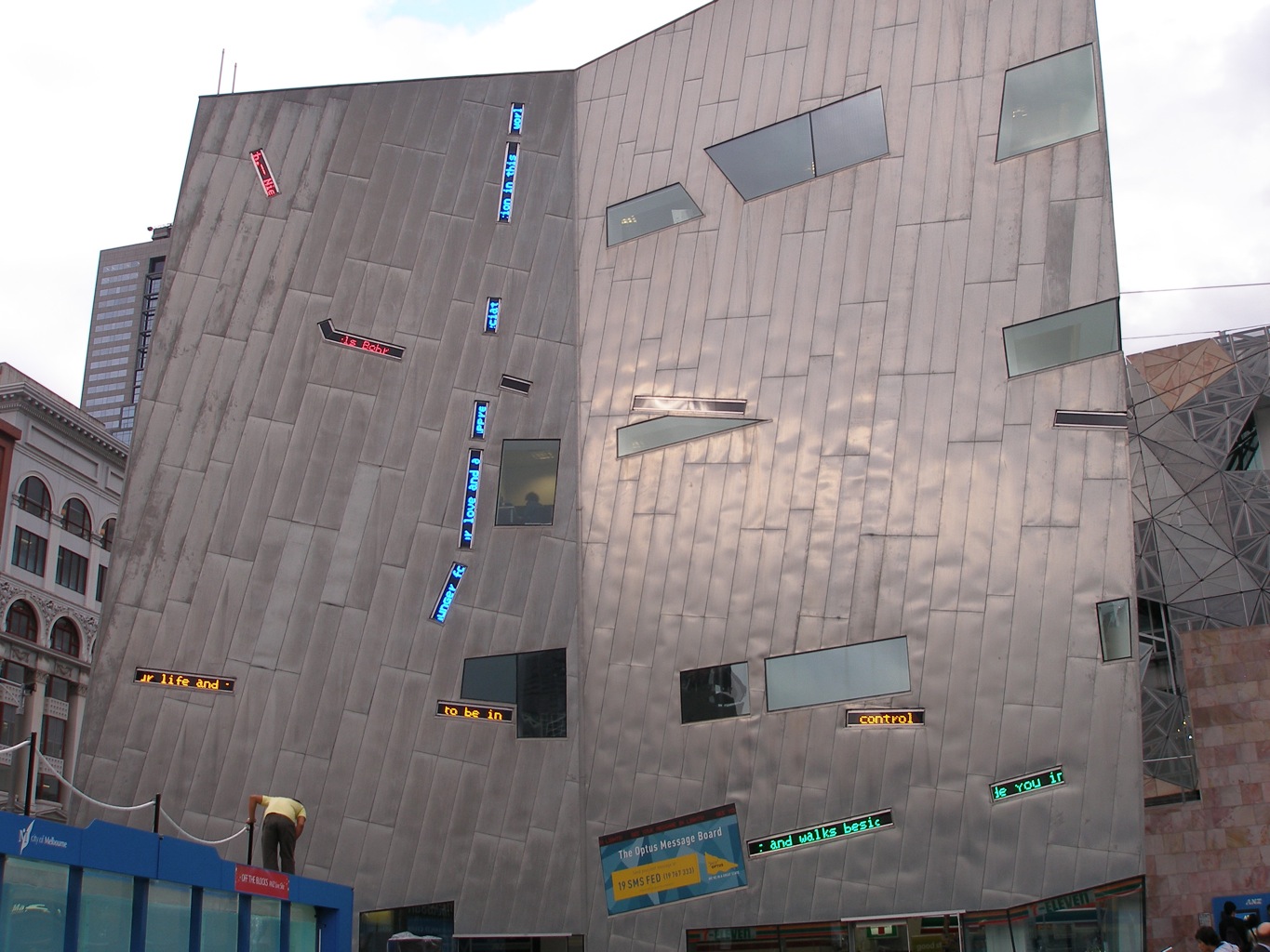
BEAM, which, perversely after what I have said above, means that I will fall to the trap of spectacle, where the art form is disassociated from the core form. The alternate position and exciting opportunity with the Cameron Offices is to use light projection as dressing to enhance the reading and appreciation of the tectonic - to integrate tightly with the building in such a way (involving projection mapping) feels more natural to my architectural instincts. An interesting light projection that takes this alternate position is ToDo's
Artificial Dummies which are a flock that avoids and so highlights fenestrations in the wall. Another interesting project is Daniel Rossa's
555 Kubik for the Hamburg Kunsthalle, which reconfigures the buildings geometry.
The development of this project for the Cameron Offices can be followed with the label
8203 (the UC
Master of Digital Design unit number).


