Monday, December 13, 2010

Reflections on Generic City

Performance night was successful and a lot of fun (see photos following). Many thanks to Mitchell Whitelaw for organising the project and superb guidance throughout.

Generic City C8 - performance night, photographer Mitchell Whitelaw
Not such a generic audience...
Picnic rug on kerb side?
Refining after the dry run, I developed a tool to set, remember and edit where windows are, and so was able to make growth avoid windows. This worked very smoothly (although it was a little cumbersome to edit using arrow keys) and was a great visual improvement on the untidiness of the dry run. 

Also after the dry run, I slowed the growth rate and increased the range of growth speeds, but perhaps could have gone further - I was trying to balance against speed to show at a glance the dynamic and iterative quality. On the night in response to feedback I did in fact slow it down further. Mitchell described the generated cities as having an elusive quality - just as soon as they were fully grown they disappeared, and because you never knew when they were fully grown and therefore about to disappear, it was impossible to photograph! Mitchell's very nice suggestion was to pause before disappearing and then fade in transition. 

This got me thinking about other ways to improve legibility. As each frame many cells can grow and as each cell can have many children or branches, it quickly becomes difficult to follow new growth. Perhaps I could have more tightly controlled growth by keeping track of a cell's age since it last grew and limiting future growth in this way, or by limiting number of children or branching so that growth is more linear - I didnt consider limiting branching previously because I was only thinking about density which I controlled by number of neighbours.

Further it might be interesting to trace pathways through the city or highlight precincts defined for example by blocks serviced by particular streets, blocks adjoining particular public squares or neighborhoods of the same block type. This would assist in reading the structure of the city.

On the performance night it was again abundantly clear that the simplest geometries were the most striking and legible at this scale. Perhaps, against what I wrote previously, this is cause to extend a shape grammar with little variance and highly structured relationships endlessly across the facade. Perhaps a Cameron Offices or other John Andrews skin, or even a skin based on the Nolli Plan of Rome would have been really effective. This is a lesson about misjudgment, a reminder to test often and early.

The most significant difference between Generic City and a potential John Andrews shape grammar is that Generic City has non-deterministic relationships adding an exciting additional layer of complexity - that of allowing emergent orders, simply from interactions between neighbouring cells. Harnessing emergence better simulates organic city growth, accommodating multiple competing forces, and so makes for the beginnings of a potentially powerful analytical or design tool.

One final loose end, I previously suggested making Generic City interactive. I never pursued this because I judged that apart from conditions that changed the speed of growth or events that terminated a city and began a new one it would be difficult to make the interactivity legible - what condition could legibly control block type for instance? Further any interaction would potentially clash with internal growth imperatives, making the underlying system more difficult to read.

This project is principally concerned with exploring a generative system and grounding it by the interpretive content: tectonic dressing of structure, articulating surface and fenestration; generative system as emphasis of the architecture as system; networked city precinct to reveal the seeds for a greater whole contained within a single building; an iterative production to imply the conflation of past, future and alternate realities. It is critical that the system is legible.

Generic City C8 - performance night, photographer Mitchell Whitelaw

Cameron Offices: some further documentation

John Andrews, Cameron Offices, Canberra, photo of courtyard garden from 'John Andrews: Architecture a Performing Art' 1982, Jennifer Taylor & John Andrews
John Andrews, Cameron Offices, Canberra, office plan from 'John Andrews: Architecture a Performing Art' 1982, Jennifer Taylor & John Andrews
John Andrews, Cameron Offices, Canberra, photo of East elevation from 'John Andrews: Architecture a Performing Art' 1982, Jennifer Taylor & John Andrews
John Andrews, Cameron Offices, Canberra, photo of T beams and pedestrian bridge across courtyard garden from 'John Andrews: Architecture a Performing Art' 1982, Jennifer Taylor & John Andrews
John Andrews, Cameron Offices, Canberra, circulation diagram from 'John Andrews: Architecture a Performing Art' 1982, Jennifer Taylor & John Andrews
John Andrews, Cameron Offices, Canberra, photo of structural system from 'John Andrews: Architecture a Performing Art' 1982, Jennifer Taylor & John Andrews
John Andrews, Cameron Offices, Canberra, module diagram from 'John Andrews: Architecture a Performing Art' 1982, Jennifer Taylor & John Andrews
John Andrews, Cameron Offices, Canberra, photo of courtyard garden from 'John Andrews: Architecture a Performing Art' 1982, Jennifer Taylor & John Andrews
John Andrews, Cameron Offices, Canberra, plan showing pedestrian spines from 'John Andrews: Architecture a Performing Art' 1982, Jennifer Taylor & John Andrews
John Andrews, Cameron Offices, Canberra, sections from 'John Andrews: Architecture a Performing Art' 1982, Jennifer Taylor & John Andrews
John Andrews, Cameron Offices, Canberra, photo of liminal space from 'John Andrews: Architecture a Performing Art' 1982, Jennifer Taylor & John Andrews
John Andrews, Cameron Offices, Canberra, photo of pedestrian street seen obliquely from office wing from 'John Andrews: Architecture a Performing Art' 1982, Jennifer Taylor & John Andrews
John Andrews, Cameron Offices, Canberra, section diagram showing fit to topography from 'John Andrews: Architecture a Performing Art' 1982, Jennifer Taylor & John Andrews
John Andrews, Cameron Offices, Canberra, photo of West elevation from 'John Andrews: Architecture a Performing Art' 1982, Jennifer Taylor & John Andrews

Extending John Andrews - a shape grammar?

One part of my early proposal, that I have mulled over for sometime but never pursued, was for a generative cityscape that remixed the geometry of Cameron Offices and other John Andrews or exemplar modern architectures. 

I created a Generic City and continued refining it, while holding off on fitting a  shape grammar to it as a skin. While it should be possible with a small amount of adaption to plug in almost any simple geometry (including non-orthogonal geometry by switching back to an 'off-lattice' Eden Growth Model which would require a different method of locating neighbouring cells), I felt that a shape grammar skin could be deterministic with highly structured relationships and that the open-ended further abstracted generic geometry was perhaps more robust in generating differentiation.

When for example I was considering a shape grammar for the Cameron Offices, I was immediately stuck with a couple of problems. All of the offices are oriented E-W to reduce direct sunlight (early morning / late afternoon). If I was to extend this endlessly it would be pretty boring - monotonous. This is the first problem - that Andrews did not design for variation: he designed in fixed modules (in a time before the changed economies of digital fabrication). Perhaps it would have been interesting to abstract further John Andrews grammar and introduce limited variance - but would this be true to Andrews? Probably I should have conceived this as an updating of his geometry appropriate for this time, that could be true if it didnt break any fundamental rules - whatever they might be. For example maybe I could decide that E-W orientation is not fundamental, but shading is - however if I introduced N-S orientation then I would have to design new shading and a way of turning corners. This is the second problem, I would have to design - the Cameron Offices does not have all of the information required for a shape grammar of an entire city, it is only a piece. 

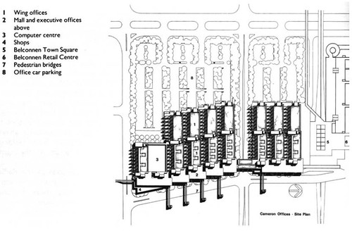
Andrews clearly understood his projects as systems or networks, designing them to be extended and connected with other projects. However the extensions he considered, for example the Bellmere Public School (see below), were a couple of additional modules. Andrews I doubt would intend the same geometry, even with minor variance, to be extended endlessly - particularly across different programs. This is made clear with the interface/connections at the boundaries of the Cameron Offices where Andrews designed pedestrian bridges to connect with housing but did not indicate any geometry or even massing for the housing, and further where he did sketch a town square and retail centre adjacent on the North the geometry is manifestly distinct. This principle is further reinforced later by the Bus Interchange where Andrews makes the pedestrian circulation circular tubes - a more obvious contrast to the adjacent Cameron Offices is not imaginable.

John Andrews, Cameron Offices, site plan from 'Australian Architecture Since 1960', 2nd Edition, 1990, Jennifer Taylor

John Andrews, Cameron Offices and Belconnen Bus Interchange, Canberra,  photo from 'John Andrews: Architecture a Performing Art' 1982, Jennifer Taylor & John Andrews
Andrews shows how to make connections (pedestrian bridges), but as to what to connect to - well this could be almost any geometry. To illustrate the variety of Andrews geometries, and as a reminder of how significant an architect he has been, following is a selection of potential shape grammar seeds. Ultimately I felt that if I was designing I wanted it to be legible that it was my hand not Andrews and so I stayed with the generic geometry. Of course in the sense that Generic City is a system it is still closely associated with Andrews.

John Andrews, Scarborough College, University of Toronto, plan from 'John Andrews: Architecture a Performing Art' 1982, Jennifer Taylor & John Andrews
John Andrews, Scarborough College, University of Toronto, photo from 'John Andrews: Architecture a Performing Art' 1982, Jennifer Taylor & John Andrews
John Andrews, Bellmere Public School, Toronto, plan from 'John Andrews: Architecture a Performing Art' 1982, Jennifer Taylor & John Andrews
John Andrews, Bellmere Public School, Toronto, elevation from 'John Andrews: Architecture a Performing Art' 1982, Jennifer Taylor & John Andrews
John Andrews, Guelph University (Ontario) student residences, plan from 'John Andrews: Architecture a Performing Art' 1982, Jennifer Taylor & John Andrews
John Andrews, Guelph University (Ontario) student residences, photo from 'John Andrews: Architecture a Performing Art' 1982, Jennifer Taylor & John Andrews
John Andrews, African Place, Expo '67, axonometric plan from 'John Andrews: Architecture a Performing Art' 1982, Jennifer Taylor & John Andrews
John Andrews, African Place, Expo '67, photo from 'John Andrews: Architecture a Performing Art' 1982, Jennifer Taylor & John Andrews
John Andrews, Miami Port Passenger Terminal, section diagram from 'John Andrews: Architecture a Performing Art' 1982, Jennifer Taylor & John Andrews
John Andrews, Miami Port Passenger Terminal, photo from 'John Andrews: Architecture a Performing Art' 1982, Jennifer Taylor & John Andrews
John Andrews, The Canadian National (CN) Tower,  Toronto, photo from 'John Andrews: Architecture a Performing Art' 1982, Jennifer Taylor & John Andrews
John Andrews, Gund Hall studios, Harvard Graduate School of Design, photo from 'John Andrews: Architecture a Performing Art' 1982, Jennifer Taylor & John Andrews
John Andrews, Gund Hall studios, Harvard Graduate School of Design, section from 'John Andrews: Architecture a Performing Art' 1982, Jennifer Taylor & John Andrews
John Andrews, King George Tower, Sydney, photo from 'John Andrews: Architecture a Performing Art' 1982, Jennifer Taylor & John Andrews
John Andrews, Toad Hall student residences, Australian National University (ANU), plan from 'John Andrews: Architecture a Performing Art' 1982, Jennifer Taylor & John Andrews


John Andrews, Toad Hall student residences, Australian National University (ANU), photo from 'John Andrews: Architecture a Performing Art' 1982, Jennifer Taylor & John Andrews
John Andrews, New Res student residences, University of Canberra, unit plan from 'John Andrews: Architecture a Performing Art' 1982, Jennifer Taylor & John Andrews


John Andrews, New Res student residences, University of Canberra, photo from 'John Andrews: Architecture a Performing Art' 1982, Jennifer Taylor & John Andrews
John Andrews, Callum Offices, Woden, Canberra, site plan from 'John Andrews: Architecture a Performing Art' 1982, Jennifer Taylor & John Andrews
John Andrews, Callum Offices, Woden, Canberra, photo from 'John Andrews: Architecture a Performing Art' 1982, Jennifer Taylor & John Andrews
John Andrews, House at Eugowra (near Parkes), NSW, photo from 'John Andrews: Architecture a Performing Art' 1982, Jennifer Taylor & John Andrews

Sunday, December 12, 2010

Interpretation key to projection success

I have previously said that I felt that projections that a have a critical content closely associated with place and/or are tightly configured to the tectonic of the surface projected onto are more successful - ie that the layer they add to a place is principally interpretive and that this therefore should be an important frame in their critique.

An old favourite of mine is Scott Snibbe's voronoi Boundary Functions - an interactive projection that mapped personal space. This has often been in my mind as a benchmark - interactive and interpretive, with a legible tectonic closely related to the voronoi system at a human scale. The voronoi diagram is highly suited to this purpose - it is simply a boundary drawn perpendicular halfway between points (the points are people in this case).

Scott Snibbe, Boundary Functions 
Following are two student projects included in Output 09 that are variations on this theme. Frederic Eyl, Gunnar Green and Richard The's Sonderzug is a proposal to remember, as a ethereal trace, trains that deported Jewish people to ghettos, while Oliver Ellger and Jeffrey Gold's Ipunkt is a proposal for a fairly impractical personal navigation device for museums and galleries.

Frederic Eyl, Gunnar Green and Richard The, Sonderzug - ghetto destination projected from Berlin bridge
Frederic Eyl, Gunnar Green and Richard The, Sonderzug - ghost train
Oliver Ellger and Jeffrey Gold, Ipunkt